


- Destroy this mad brute Poster
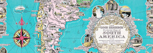
- Der gute Nachbar von Südamerika Poster
- Italien mit Vatikanstadt Poster
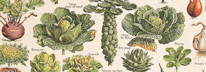
- Zwiebeln Poster
- Bec-Kina Poster
- Kohler Chocolat Poster
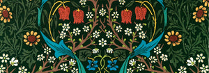
- Strawberry Thief Poster
- Tom Krojer Ausstellungs-Poster
- Ernst Kirchner Ausstellung Poster
- El Comienzo Poster
- Parler Seul 2 Poster
- Ring der Dämmerung Poster
- Parler Seul Poster
- Faun und Nymphe Poster
- The Dream Poster
- Le Concert Poster
- Vogel, der eine Wolke durchquert Poster
- Weibliche Künstlerin Poster
- Revenge of the Pink Panther Poster
- Frau und Vogel in der Nacht Poster
- Bauhaus 20 Poster
- Blauer japanischer Kranich Poster
- Snoopy Come Home Poster
- Nach London mit Jet Clipper Poster
- Kyushu-Okinawa Poster
- Xerez Pedro Domecq Poster
- Balsam Aperitif Poster
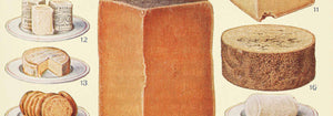
- Butter Poster
- Crans Poster
- Monte Carlo Poster
- Bier und Zigarette Poster
- West Coast of Mexico Poster
- Rita Gaufres Poster
- Hibiskus Poster
-
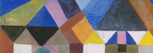
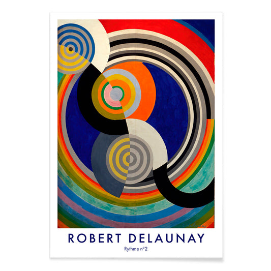
Rythme n°2 Poster
Robert Delaunay · 1938 · Abstrakter Rhythmus-Kunstdruck mit ineinandergreifenden Kreisen und Bögen in lebhaften Primärfarben
Poster ab €9 · Gerahmt ab €16
Normaler Preis Von €6,00Normaler Preis -
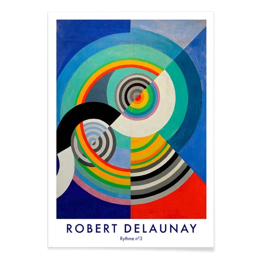
Rythme n°3 Poster
Robert Delaunay · 1938 · Energetisches abstraktes Poster mit konzentrischen Kreisen in Blau, Rot, Gelb und Grün
Poster ab €9 · Gerahmt ab €16
Normaler Preis Von €6,00Normaler Preis -
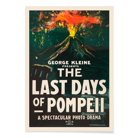
Die letzten Tage von Pompeji Poster
H.C. Miner · 1913 · Dramatisches Poster eines Vulkanausbruchs mit markanter Typografie und glühendem orangefarbenem Rauch
Poster ab €9 · Gerahmt ab €16
Normaler Preis Von €6,00Normaler Preis -
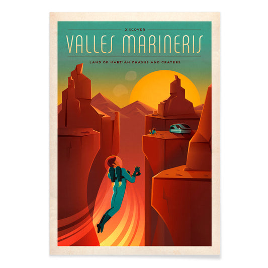
Valles Marineris Poster
SpaceX · 2015 · Ausdrucksstarker Poster im Vintage-Stil mit einsamer Astronautensilhouette über marsianischer Schlucht
Poster ab €9 · Gerahmt ab €16
Normaler Preis Von €6,00Normaler Preis -
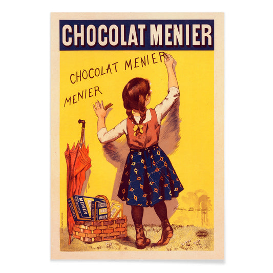
Chocolat Menier Poster
Firmin Bouisset · 1896 · Verspieltes französisches Poster mit Mädchen, das Chocolat Menier an eine gelbe Wand schreibt
Poster ab €9 · Gerahmt ab €16
Normaler Preis Von €6,00Normaler Preis -
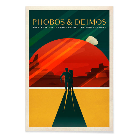
Phobos und Deimos Poster
SpaceX · 2020 · Retro-Mars-Reiseposter mit einem Paar unter Phobos und Deimos in roten Tönen
Poster ab €9 · Gerahmt ab €16
Normaler Preis Von €6,00Normaler Preis -
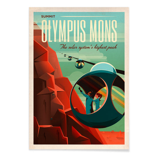
Olympus Mons Poster
SpaceX · 2021 · Retrofuturistisches Mars-Reiseposter mit Gondeln, die die roten Hänge des Olympus Mons erklimmen
Poster ab €9 · Gerahmt ab €16
Normaler Preis Von €6,00Normaler Preis -
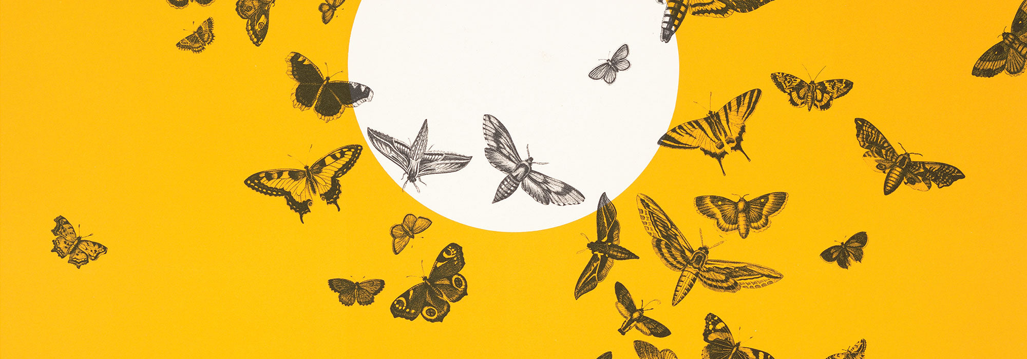
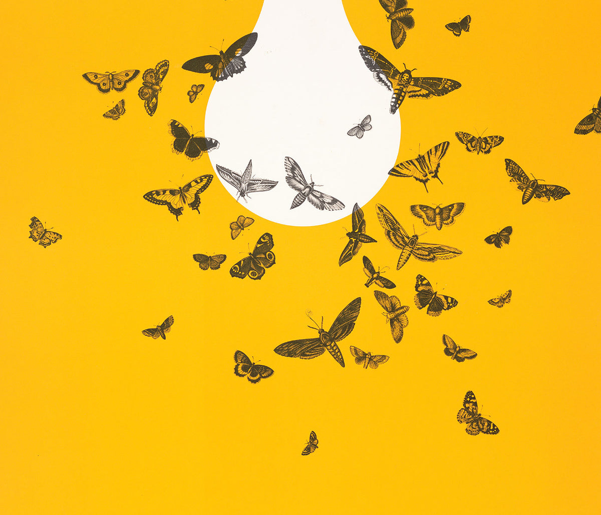
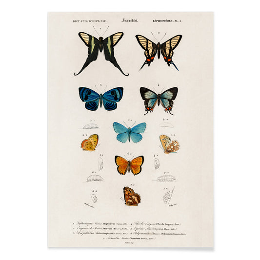
Blaue und braune Schmetterlinge Poster
Charles Dessalines D'Orbigny · 1806 · Feiner Kunstdruck wissenschaftlicher Schmetterlingsplatten in kühlen Blau- und warmen Brauntönen
Poster ab €9 · Gerahmt ab €16
Normaler Preis Von €6,00Normaler Preis -
Linum glandulosum Poster
Charles Dessalines d'Orbigny · 1847 · Zarter botanischer Kunstdruck des gelben Leins mit präziser Linienführung auf leicht gealtertem Papier
Poster ab €9 · Gerahmt ab €16
Normaler Preis Von €6,00Normaler Preis -
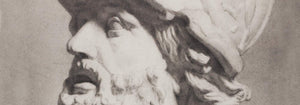
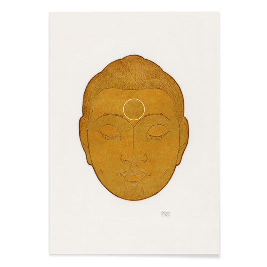
Kopf des Buddha Poster
Reijer Stolk · 1943 · Ruhiger Kunstdruck mit Buddhakopf in warmen Goldtönen und sanften Graphitkonturen
Poster ab €9 · Gerahmt ab €16
Normaler Preis Von €6,00Normaler Preis -
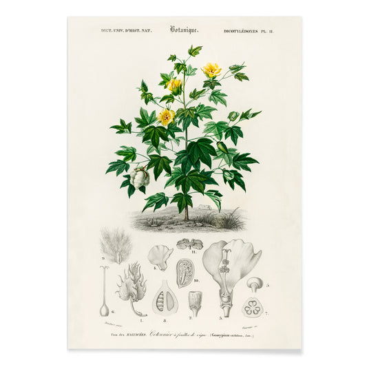
Gossypium vitifolium Poster
Charles Dessalines d'Orbigny · 1876 · Zarter botanischer Kunstdruck der Sea-Island-Baumwolle mit gelappten Blättern, blassen Blüten und Kapseln
Poster ab €9 · Gerahmt ab €16
Normaler Preis Von €6,00Normaler Preis -
Avocado (Persea) Poster
Amanda Almira Newton · 1916 · Detaillierter botanischer Kunstdruck der Avocado mit aufgeschnittenem Fruchtkörper, großem Kern und glänzenden Blättern
Poster ab €9 · Gerahmt ab €16
Normaler Preis Von €6,00Normaler Preis -
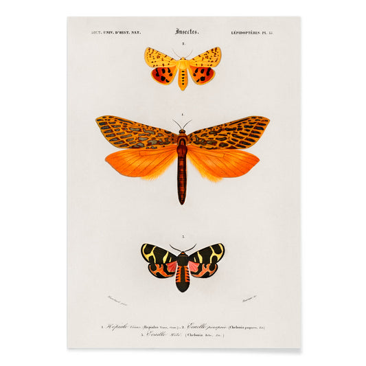
Orange Motten Poster
Charles Dessalines D' Orbigny · 1841 · Lebendiger orangefarbener Motten-Kunstdruck in detailreicher präziser naturhistorischer Tafeldarstellung
Poster ab €9 · Gerahmt ab €16
Normaler Preis Von €6,00Normaler Preis -
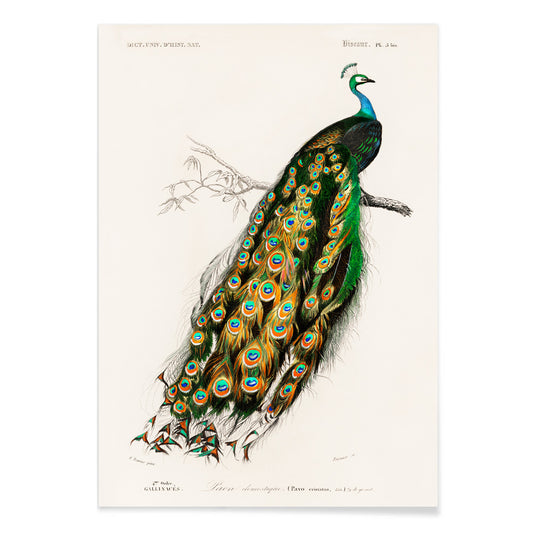
Pavo Cristatus Poster
Charles Dessalines D' Orbigny · 1849 · Eleganter Kunstdruck des Indischen Pfaus mit juweligen Gefiederfarben und fein naturalistischer Ausführung
Poster ab €9 · Gerahmt ab €16
Normaler Preis Von €6,00Normaler Preis -
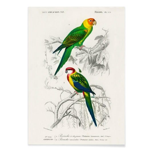
Sittich Poster
Charles Dessalines D' Orbigny · 1806 · Lebendiger Sittich-Kunstdruck mit sitzenden Vögeln und präziser naturkundlicher Detailzeichnung
Poster ab €9 · Gerahmt ab €16
Normaler Preis Von €6,00Normaler Preis -
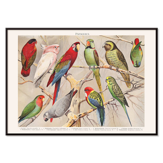
Papageien III Poster
Charles Dessalines D' Orbigny · 1841 · Lebhafter Papageien-Kunstdruck mit Vögeln auf Ast und präzisen naturalistischen Details
Poster ab €9 · Gerahmt ab €16
Normaler Preis Von €6,00Normaler Preis -
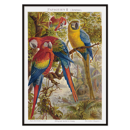
Papageien II Poster
Institut of Leipzig · 1895 · Prächtiger Kunstdruck mit drei lebendigen Aras auf tropischen Zweigen
Poster ab €9 · Gerahmt ab €16
Normaler Preis Von €6,00Normaler Preis -
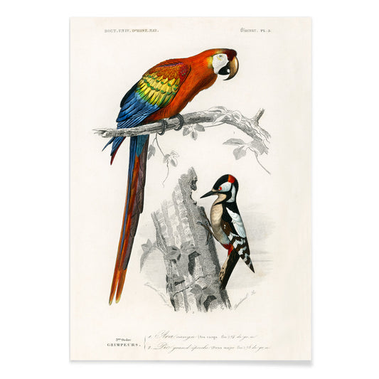
Papageien I Poster
Institut of Leipzig · 1972 · Lebhafter Papageien-Druck im Stil einer naturkundlichen Tafel mit präziser wissenschaftlicher Zeichnung
Poster ab €9 · Gerahmt ab €16
Normaler Preis Von €6,00Normaler Preis -
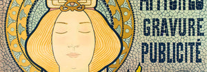
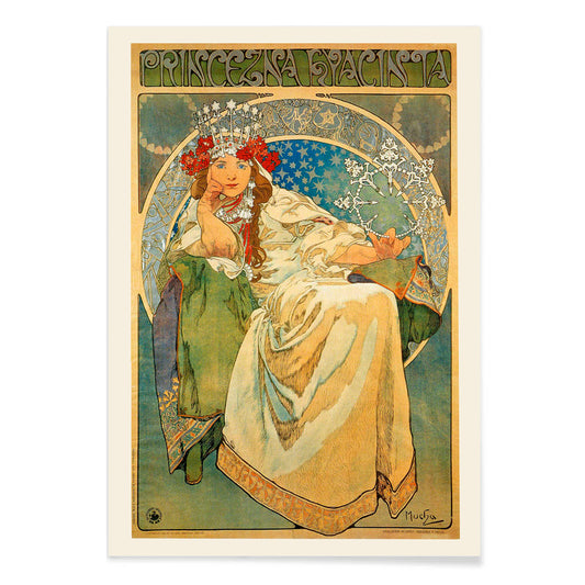
Princezna Hyacinta Poster
Alfons Mucha · 1911 · Elegantes Jugendstil-Poster einer gekrönten Prinzessin, umrahmt von feiner floraler Ornamentik
Poster ab €9 · Gerahmt ab €16
Normaler Preis Von €6,00Normaler Preis -
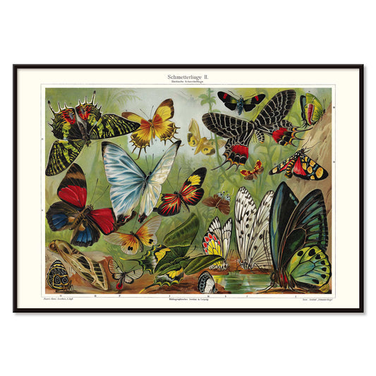
Schmetterlinge II Poster
Institut of Leipzig · 1971 · Vintage-Poster mit farbenprächtigen Schmetterlingsarten in präziser, lehrreicher wissenschaftlicher Anordnung
Poster ab €9 · Gerahmt ab €16
Normaler Preis Von €6,00Normaler Preis -
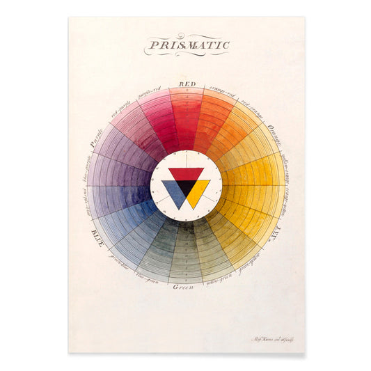
Prismatisches Farbrad Poster
Moses Harris · 1766 · Aufklärerisches Farbrad als präziser Kunstdruck mit leuchtenden Primär- und Sekundärtönen
Poster ab €9 · Gerahmt ab €16
Normaler Preis Von €6,00Normaler Preis -
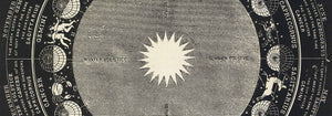
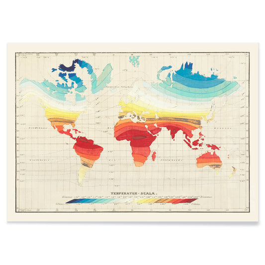
Welt-Temperaturkarte Poster
Wilhelm Ebel · 1850 · Detaillierter Vintage-Druck der globalen Temperaturzonen mit sanften Farbverläufen
Poster ab €9 · Gerahmt ab €16
Normaler Preis Von €6,00Normaler Preis -
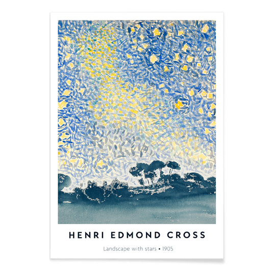
Landschaft mit Sternen Poster
Henri-Edmond Cross · 1905 · Pointillistischer nächtlicher Landschafts-Kunstdruck mit schimmernden Sternen und mediterraner, traumhafter Atmosphäre
Poster ab €9 · Gerahmt ab €16
Normaler Preis Von €6,00Normaler Preis -
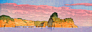
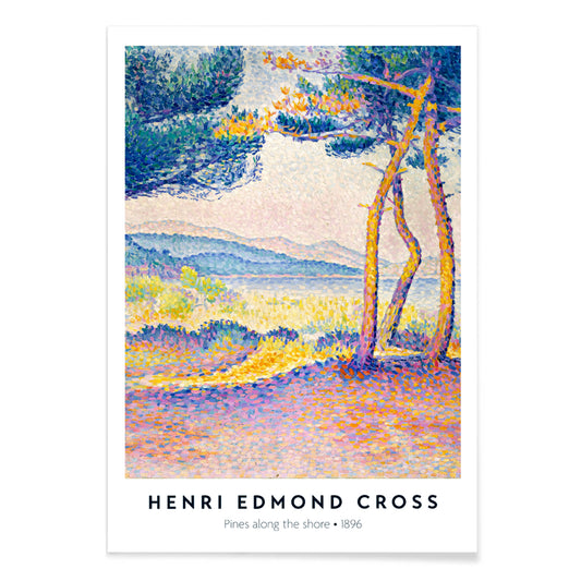
Kiefern an der Küste Poster
Henri-Edmond Cross · 1896 · Leuchtender pointillistischer Kunstdruck der Küste mit Kiefern, Klippen und schimmerndem Blauwasser
Poster ab €9 · Gerahmt ab €16
Normaler Preis Von €6,00Normaler Preis -
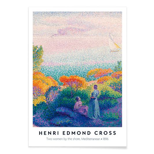
Zwei Frauen am Ufer Poster
Henri-Edmond Cross · 1896 · Strahlender Kunstdruck vom Meer mit zwei Frauen im schimmernden Licht und ruhigem Horizont
Poster ab €9 · Gerahmt ab €16
Normaler Preis Von €6,00Normaler Preis -
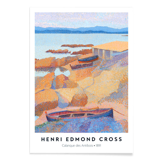
Calanque des Antibois Poster
Henri-Edmond Cross · 1891 · Neoimpressionistischer Kunstdruck einer Küstenszene mit glitzerndem Meer und warmen Felsen
Poster ab €9 · Gerahmt ab €16
Normaler Preis Von €6,00Normaler Preis -
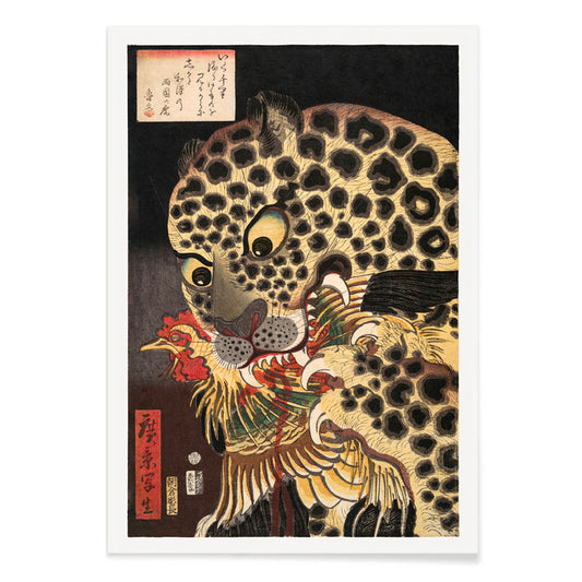
Der Tiger von Ryōkoku Poster
Utagawa Hirokage · 1860 · Dramatischer Ukiyo-e Kunstdruck eines Tigers, der einen Hahn ergreift unter kraftvoller Kalligrafie
Poster ab €9 · Gerahmt ab €16
Normaler Preis Von €6,00Normaler Preis -
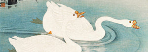
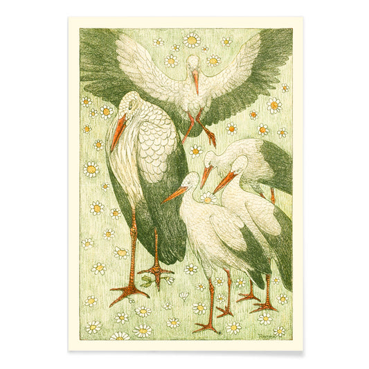
Fünf Störche auf einer Wiese Poster
Theo van Hoytema · 1898 · Ruhiger Storchen-Druck in einer Wiese mit luftiger Linienführung und sanften Grüntönen
Poster ab €9 · Gerahmt ab €16
Normaler Preis Von €6,00Normaler Preis -
Boon Poster
Johann Georg van Caspel · 1904 · Art‑Nouveau-Poster mit lesender Frau, eingerahmt von fließenden floralen Ornamenten
Poster ab €9 · Gerahmt ab €16
Normaler Preis Von €6,00Normaler Preis -
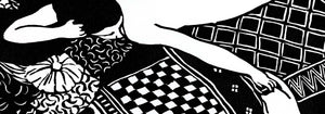
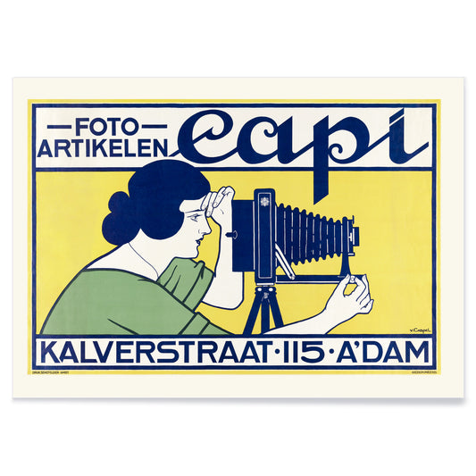
Capi Poster
Johann Georg van Caspel · 1912 · Elegantes Jugendstil-Poster mit Frau, Kamera und kräftigen blauen Akzenten
Poster ab €9 · Gerahmt ab €16
Normaler Preis Von €6,00Normaler Preis -
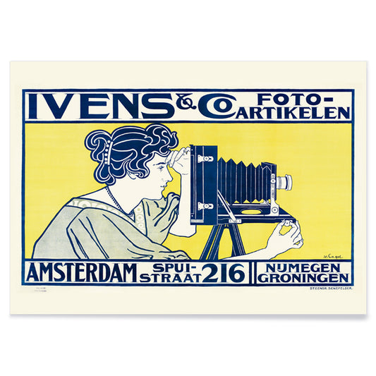
Ivens & Co. Poster
Johann Georg van Caspel · 1899 · Jugendstil-Poster mit eleganter Figur, expressiver Grafik und klaren Blau-Gelb-Kontrasten
Poster ab €9 · Gerahmt ab €16
Normaler Preis Von €6,00Normaler Preis -
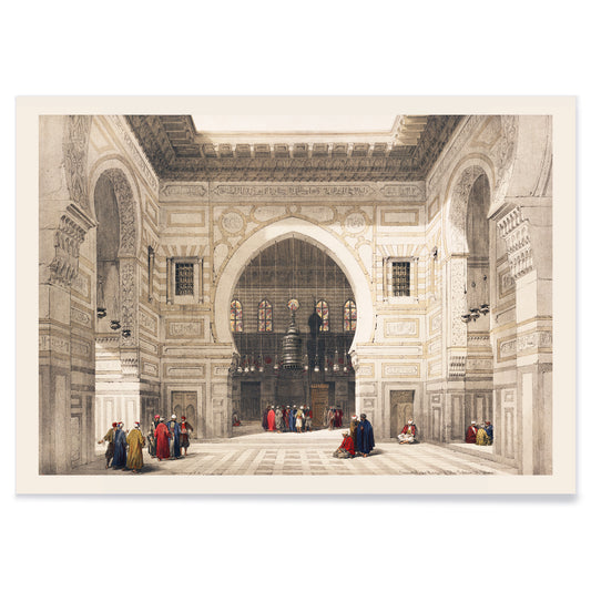
Innenraum der Moschee des Sultans von Ghoree Poster
David Roberts · 1839 · Atmosphärisches Poster mit Moscheeinnerem, hohen Bögen, weichem Licht und ruhigen Figuren
Poster ab €9 · Gerahmt ab €16
Normaler Preis Von €6,00Normaler Preis -
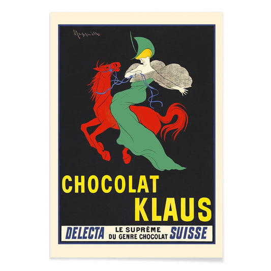
Chocolat Klaus Poster
Leonetto Cappiello · 1903 · Auffälliges Poster mit rotem Pferd und grün gekleideter Reiterin im Belle-Époque-Kontrast
Poster ab €9 · Gerahmt ab €16
Normaler Preis Von €6,00Normaler Preis -
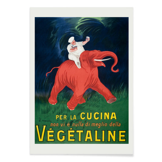
Vegetaline Poster
Leonetto Cappiello · 1910 · Verspielter Koch auf einem roten Elefanten in einem markanten französischen Werbeposter
Poster ab €9 · Gerahmt ab €16
Normaler Preis Von €6,00Normaler Preis -
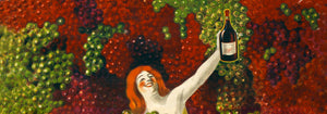
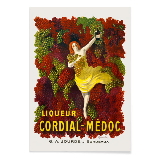
Cordial-Médoc Poster
Leonetto Cappiello · 1907 · Fröhliches Likör-Poster mit Tänzerin in gelbem Kleid und herabfallenden Trauben
Poster ab €9 · Gerahmt ab €16
Normaler Preis Von €6,00Normaler Preis -
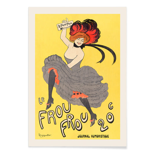
Le Frou Frou Poster
Leonetto Cappiello · 1899 · Lebhafter Poster mit dynamischer Cancan-Tänzerin, kräftige Typografie und Belle-Époque-Energie
Poster ab €9 · Gerahmt ab €16
Normaler Preis Von €6,00Normaler Preis


36/706 items
- Rythme n°2 Poster
- Rythme n°3 Poster
- Die letzten Tage von Pompeji Poster
- Valles Marineris Poster
- Chocolat Menier Poster
- Phobos und Deimos Poster
- Olympus Mons Poster
- Prismatisches Farbrad Poster
- Landschaft mit Sternen Poster
- Kiefern an der Küste Poster
- Zwei Frauen am Ufer Poster
- Calanque des Antibois Poster
- Der Tiger von Ryōkoku Poster
- Boon Poster
- Vegetaline Poster
Ein gelber Faden durch die Kunstgeschichte
Diese Sammlung ist nicht monochrom. Sie folgt dem Verhalten von Gelb im Bild: als Licht, als Warnung, als Ornament, als schneller Energieschub. In der Vintage-Poster-Kultur zieht es vom Straßenbild Aufmerksamkeit; in der modernen Malerei wird es zur Struktur; in der Naturgeschichte suggeriert es Pollen, Schale und sonnengebleichtes Papier. Lesen Sie diese Poster und Kunstdrucke als ein Vokabular der Wärme, von butterweichen Glanzlichtern bis zu scharfen, elektrischen Tönen, die die Temperatur der Wandkunst verändern.
Gold, Zitrus und die Logik der Farbe
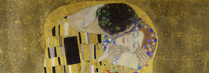
Wenige Werke zeigen Gelb als Luxus und Methode so deutlich wie The Kiss (1907–1908) von Gustav Klimt, wo metallische Gelbtöne wie Tesserae wirken und Farbe in Oberfläche und Oberfläche in Symbolik verwandeln. Am anderen Ende steht Cercle chromatique von Michel Eugène Chevreul, das Farbton als messbare Information behandelt, ein wissenschaftliches Diagramm, das weiterhin als dekoratives Design lesbar ist. Zusammen erklären sie, warum Gelb über Epochen hinweg Bestand hat: Es kann Opulenz, Erleuchtung oder Methode signalisieren und einen Vintage-Druck zugleich unmittelbar und intellektuell fundiert erscheinen lassen.
Gelbe Akzente in der Raumgestaltung
In der Raumgestaltung funktioniert Gelb am besten, wenn es eine Aufgabe hat. Ein schmaler Flur profitiert von einem kleinen Aufleuchten nahe einem Spiegel; eine Küche empfängt Gelbtöne, die zitrus- oder getreidehaft wirken; ein Arbeitszimmer verkraftet schärfere, analytische Nuancen. Kombinieren Sie gelbe Poster mit kalkigen Weißtönen, Nussbaum und Leinen für stille Wärme oder setzen Sie sie zu tiefen Grün- und Tintenblau-Kontrasten. Für Zurückhaltung und Geometrie wechseln Sie zwischen Minimalistisch und Abstrakt; als natürlicher Gegenpol hält Botanik die Farbe an Stielen, Samenständen und wissenschaftlicher Beobachtung fest.
Eine Galeriewand mit Muster und Struktur kuratieren
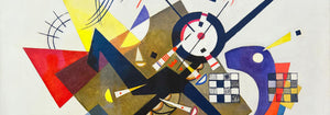
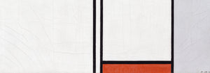
Beim Aufbau einer Galeriewand denken Sie in Rhythmen: Muster, Raster, dann eine einzelne lebhafte Note. Strawberry Thief (1883) von William Morris bringt textile Dichte und eine Gartenlogik, die moderne Möbel mildert. Balancieren Sie das mit Piet Mondrians Composition in White, Red, and Yellow (1936), wo Gelb zur gemessenen Ebene wird. Ergänzen Sie kontrollierte Dynamik durch Wassily Kandinskys Circles in a circle, Bauhaus exhibition (1923), eine Brücke zwischen Ausstellungsplakat und Malerei. Zur Erweiterung passt Werbung für mutigere Typografie, Bauhaus für straffere Formensprache und Klassische Kunst als ruhigere tonale Verankerung.
Warum Gelb so präsent wirkt
Oft als bloße Dekoration abgetan, ist Gelb häufig eine kompositorische Strategie: es lenkt das Auge, impliziert Sonnenlicht oder kartiert ein System. Mit Absicht aufgehängt kann ein schmaler gelber Durchgang umliegende Farben sauberer oder tiefer erscheinen lassen, als wäre das Licht des Raums justiert, ohne eine Lampe zu berühren.