


You may also like
-
Sanremo Poster
Unbekannter Künstler · 1920 · Sonniges Sanremo-Reiseposter mit blütenreichem Vordergrund, Palmen und heller Mittelmeerbucht in lebendiger Farbpalette
Poster ab €9 · Gerahmt ab €16
Normaler Preis Von €6,00Normaler Preis -
Antibes Poster
David Dellepiane · 1910 · Elegantes Antibes Poster mit stilvoller Dame und Hund über der Mittelmeerküste
Poster ab €9 · Gerahmt ab €16
Normaler Preis Von €6,00Normaler Preis -
Reise nach Italien Poster
MORYARTY · 1920 · Sonnendurchflutetes Poster der Amalfiküste mit Felsendörfern und funkelndem Meer
Poster ab €9 · Gerahmt ab €16
Normaler Preis Von €6,00Normaler Preis -
Brazil 2 Poster
Waldomiro Goncalves Christino · 1970 · Farbiges Brasilien-Reiseposter mit klaren Formen und lebendiger sonniger Küstenstimmung
Poster ab €9 · Gerahmt ab €16
Normaler Preis Von €6,00Normaler Preis


-

"Very nice Posters. The quality is amazing and we received it very quickly !"
-

"A shop to visit absolutely. Huge selection of posters. We spent more than an hour there !"
-

"Perfect to find gift. Price are very good. An they can frame and pack it on site"


Über den Künstler
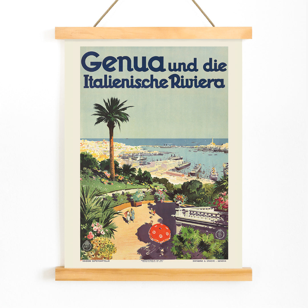
Aurelio Craffonara war ein italienischer Illustrator, der in der Blütezeit der Reisewerbung wirkte, als Poster zu wesentlichen Mitteln wurden, um Reisende für neue Ziele zu begeistern. In den frühen 1930er-Jahren prägte Craffonara das visuelle Erscheinungsbild des italienischen Fremdenverkehrs und half, eine moderne, reduzierte Ästhetik zu formen, die zugleich einladend und sofort erkennbar war. Sein Schaffen spiegelt den Optimismus und die Dynamik des Interbellums wider, eine Zeit, in der Reisen zunehmend zugänglich und begehrenswert wurde.
Craffonaras Arbeiten zeichnen sich durch die gelungene Verbindung von Klarheit und Romantik aus; Sammler schätzen seine Drucke wegen ihrer historischen Bedeutung und ihrer Fähigkeit, die Aufbruchsstimmung früher zwanziger und dreißiger Jahre lebendig werden zu lassen.
Das Kunstwerk
Entstanden 1931, wurde dieses Poster entworfen, um Genua als herausragende maritime Destination zu bewerben und die jahrhundertealte Verbindung der Stadt zum Meer zu betonen. Zu einer Zeit, in der der Tourismus entlang der ligurischen Küste florierte, lud solche Bildsprache dazu ein, sich die Ankunft in einem geschäftigen Hafen vorzustellen, in dem Industrie und Freizeit in Harmonie nebeneinander existierten. Das Werk gehört zur Tradition der vintage Reisewerbungsposter und diente gleichermaßen als praktischer Wegweiser und Inspirationsquelle für reisefreudige Besucher.
Mit der Darstellung des Hafens feiert das Poster Genuas Rolle als Tor zum Mittelmeer und reflektiert die kulturelle Bewegung, die das Reisen als Zeichen von Fortschritt und Modernität verstand. Für Liebhaber der italienischen Reisegeschichte bietet es einen reizvollen Einblick in die Sehnsüchte und Idealvorstellungen jener Epoche.
Stil und Merkmale
Die Komposition zeigt einen weiten Blick über den Hafen von Genua: stilisierte Boote gleiten über tiefblaue Wasserflächen, während die markante Skyline der Stadt im Hintergrund aufragt. Flächige, kräftige Farbfelder und vereinfachte Architekturformen verleihen dem Poster eine grafische Klarheit, die typisch für die Art-déco-Periode ist. Scharfe Linien und geometrische Formen sorgen dafür, dass die Szene auch aus der Ferne gut lesbar bleibt — ein Kennzeichen effektiver Reisewerbung.
Blau dominiert Meer und Himmel, Akzente von Grün, Gelb und Rot bringen Wärme und Lebendigkeit in die Stadtsilhouette. Die Stimmung ist hell und einladend; die selbstbewusste Gestaltung und die harmonische Farbpalette sprechen noch heute Liebhaber des vintage italienischen Designs an und machen das Werk zu einem attraktiven Beispiel klassischen Grafikdesigns.
In der Raumgestaltung
Dieses vintage Poster verleiht Wohnzimmern, Eingangsbereichen oder dem Arbeitszimmer eine dezente Küsten-Eleganz, besonders in Räumen, die eine Vorliebe für Reisen und Licht zeigen. Durch klare Linien und ausgewogene Komposition passt es sowohl zu modernen als auch zu klassischen Einrichtungsstilen, und das Hafenmotiv ergänzt mediterran inspirierte Dekore auf natürliche Weise.
Eine Kombination mit natürlichen Materialien wie Holz und Leinen oder Keramik in Marine- und Sandtönen unterstreicht den maritimen Ursprung. In einer kuratierten Bilderwand fügt es sich mühelos neben Kartendrucke und anderen italienischen Reisepostern zu einer erzählerischen Sammlung über Entdeckung und Ferne.