


- Geographischer Führer zum Frauenherzen Poster
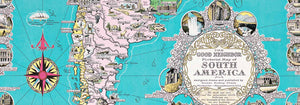
- Portugal Today Poster
- Bier und Zigarette Poster
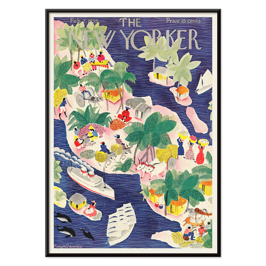
- The New Yorker Poster
- Meeresboden Poster
- Zoologischer Garten Poster
- Rettet die Wale Poster
- Papiers découpés 3 Poster
- Nu Bleu III Poster
- Marihuana Poster
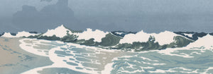
- Große Welle von Kanagawa Poster
- Grands Prix de France Poster
- Solaris Poster
- Porto Ramos-Pinto Poster
- Schwarze Katze 2 Poster
- Cordial Campari Poster
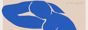
- Matisse Tanzende Figuren Poster
- Sigmund Freud hat's Poster
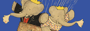
- Le Voyage de Babar Poster
- Coffea arabica 3 Poster
- Babar en Voiture Poster
- Panther Poster
- Der Tiger von Ryōkoku Poster
- Wach auf und lies Poster
- Die Große Welle Poster
- Trikolore-Ballon Poster
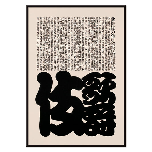
- Barcelona-Text-Poster
- The Dream Poster
- Nu Bleu II Poster
- Bleu de Ciel Poster
- Star Wars AT-AT Patent Poster
- Bauhaus 2 Poster
- Mickey Mouse Poster
- Bauhaus 11 Poster
- Papiers découpés 1 Poster
- Sitzende Katze von hinten Poster
- Histoire de Babar Poster
- Brazil 2 Poster
- Schwarzer Leopard Poster
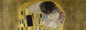
- Der Kuss Poster
- Asakusa Kinryuzan-Tempel Poster
- Bauhaus 6 Poster
- Surfbrett-Patent Poster
- Schwarze Katze 4 Poster
- Vertigo Poster
- Farbenfrohe Architektur Poster
- Sitzende Katze Poster
- La Paresse Poster
- Roter Kronenkranich Poster
- Avocado (Persea) Poster
-
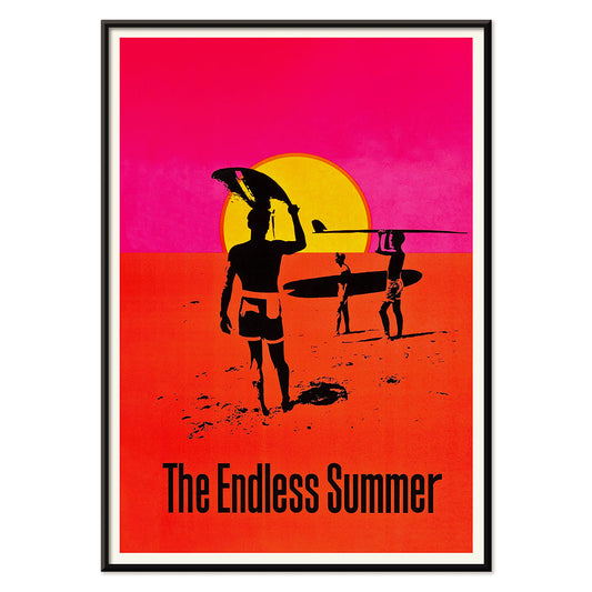
The Endless Summer Poster
Unbekannter Künstler · 1966 · Ikonisches Surf-Poster mit schwarzen Silhouetten von Surfern vor leuchtendem Sonnenuntergang
Poster ab €9 · Gerahmt ab €16
Normaler Preis Von €6,00Normaler Preis -
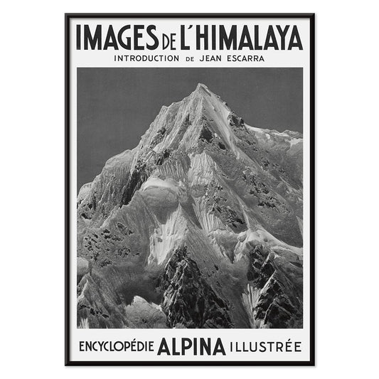
Le Siniolchu Poster
Vittorio Sella · 1899 · Monochromes Himalaya-Poster mit klarem Alpinlicht und intensiven, dramatischen Schneekämmen
Poster ab €9 · Gerahmt ab €16
Normaler Preis Von €6,00Normaler Preis -
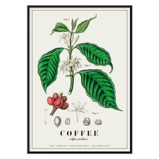
Coffea arabica Poster
John Stephenson · 1836 · Detaillierter botanischer Kunstdruck der Kaffeepflanze mit weißen Blüten und reifenden roten Beeren
Poster ab €9 · Gerahmt ab €16
Normaler Preis Von €6,00Normaler Preis -
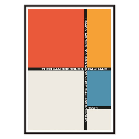
Bauhaus 21 Poster
Unbekannter Künstler · 1924 · Geometrisches Bauhaus-Poster mit orangem Kreis, blauem Block und klaren schwarzen Linien
Poster ab €9 · Gerahmt ab €16
Normaler Preis Von €6,00Normaler Preis -
The Grand Tour Poster
Karlyn Murphy · 1977 · Lebhaftes Retro-Poster des Sonnensystems mit geschwungenen Flugbahnen und markanten Planetenformen
Poster ab €9 · Gerahmt ab €16
Normaler Preis Von €6,00Normaler Preis -
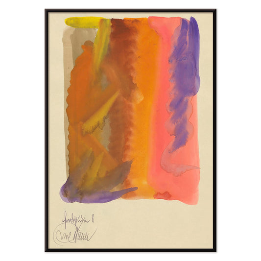
Farbstudien, 10 Blätter VIII Poster
Karl Wiener · 1923 · Flüssiger abstrakter Kunstdruck mit warmen Gelbwaschungen und tiefen Violetttönen und dynamischer Bewegung
Poster ab €9 · Gerahmt ab €16
Normaler Preis Von €6,00Normaler Preis -
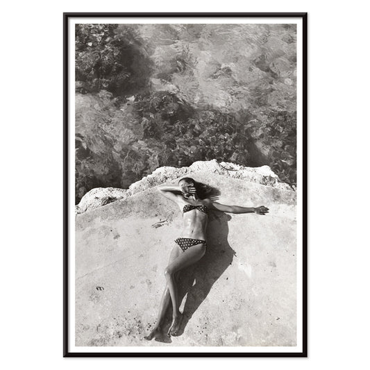
Nickerson Paine im Bikini Poster
Toni Frissell · 1971 · Schwarzweißes Bikini-Poster mit sonnendurchfluteter Küstenkomposition, klarem Kontrast und eleganter editorialer Ästhetik
Poster ab €9 · Gerahmt ab €16
Normaler Preis Von €6,00Normaler Preis -
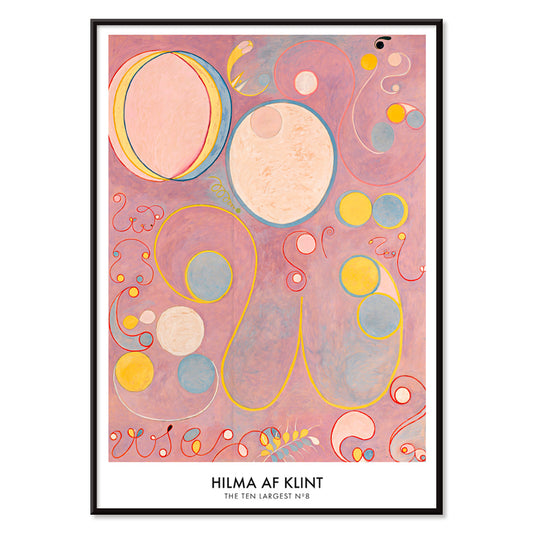
Die Zehn Größten Nr. 8 Poster
Hilma af Klint · 1907 · Ätherischer Kunstdruck abstrakter Spiralen und symbolischer Formen in Rosa, Gelb und Blau
Poster ab €9 · Gerahmt ab €16
Normaler Preis Von €6,00Normaler Preis -
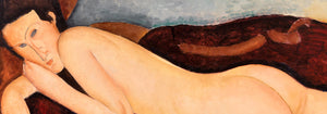
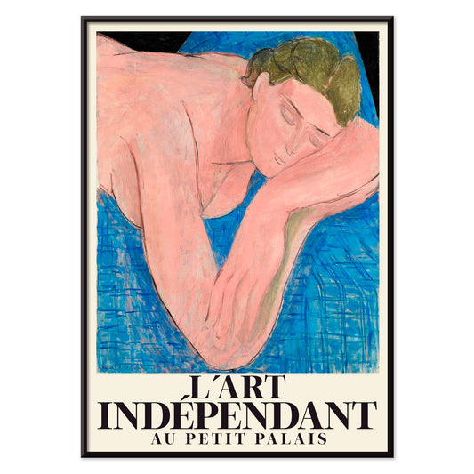
Le rêve Poster
Henri Matisse · 1935 · Traumhafter liegender Akt-Kunstdruck mit fließenden schwarzen Linien und zarten Rosa- und Blautönen
Poster ab €9 · Gerahmt ab €16
Normaler Preis Von €6,00Normaler Preis -
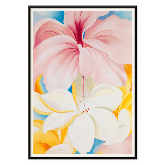
Hibiskus Poster
Georgia O’Keeffe · 1939 · Leuchtender Hibiskus-Kunstdruck mit sinnlicher Nahaufnahme der Blütenblätter und ruhiger modernistischer Schlichtheit
Poster ab €9 · Gerahmt ab €16
Normaler Preis Von €6,00Normaler Preis -
The New Yorker 2 Poster
Roger Duvoisin · 1935 · Verspieltes Insel-Poster mit lebhaften Küstendetails und kräftigen fröhlichen Mid-Century-Farben
Poster ab €9 · Gerahmt ab €16
Normaler Preis Von €6,00Normaler Preis -
Bunte Mehrfachsterne Poster
Alphonse Berget · 1925 · Lehrreicher Astronomie-Poster in klarem Blau mit kontrastreichen Sternpunkten und verbindenden Linien
Poster ab €9 · Gerahmt ab €16
Normaler Preis Von €6,00Normaler Preis -
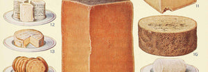
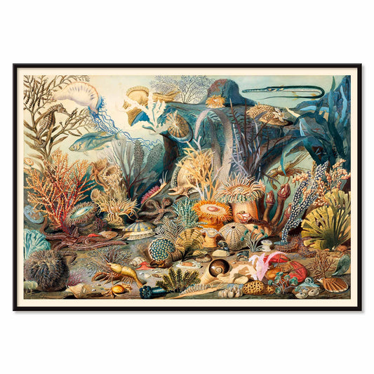
Meeresleben Poster
James M. Sommerville · 1862 · Detaillierter Meeresleben-Druck mit Korallen, Fischen und Muscheln in leuchtenden Küstentönen
Poster ab €9 · Gerahmt ab €16
Normaler Preis Von €6,00Normaler Preis -
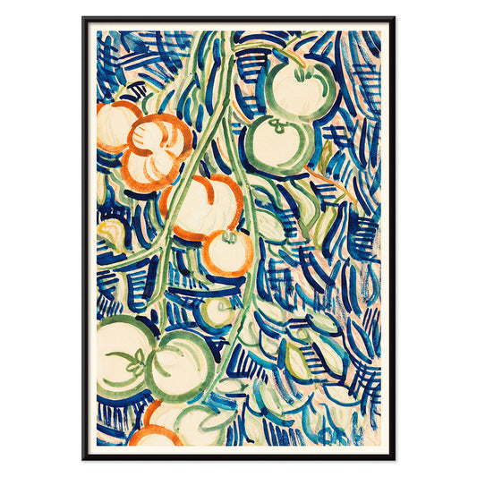
Rote und grüne Tomaten Poster
Christian Rohlfs · 1906 · Ausdrucksvoller Kunstdruck mit roten und grünen Tomaten und moderner Farbspannung
Poster ab €9 · Gerahmt ab €16
Normaler Preis Von €6,00Normaler Preis -
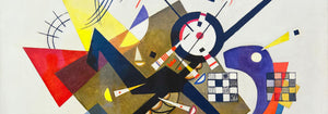
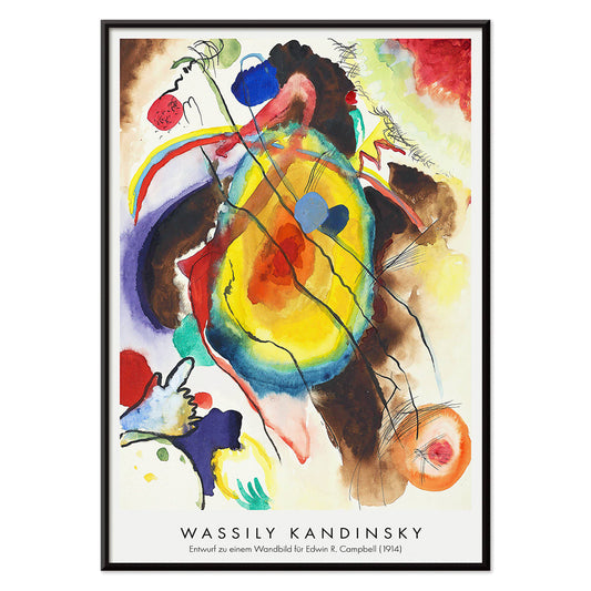
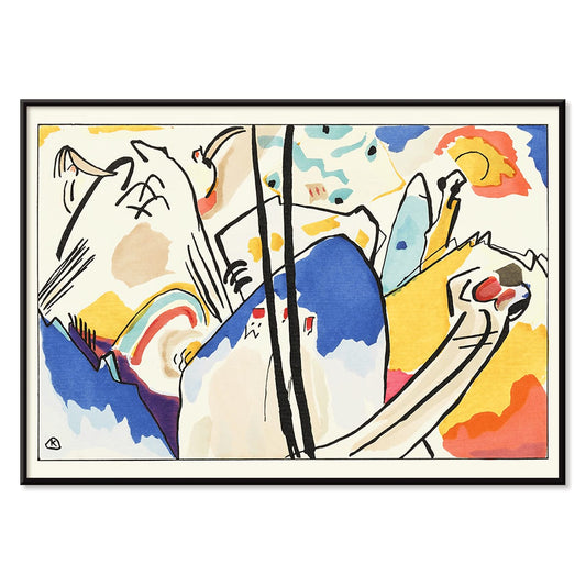
Entwurf eines Wandbilds Poster
Wassily Kandinsky · 1914 · Energiegeladenes abstraktes Poster mit geometrischen Formen und rhythmischen Linien in lebhaften Primärtönen
Poster ab €9 · Gerahmt ab €16
Normaler Preis Von €6,00Normaler Preis -
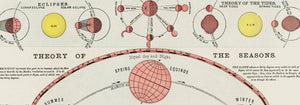
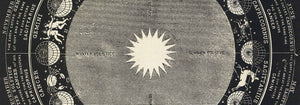
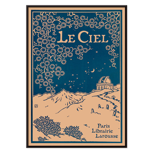
Le Ciel Poster
Alphonse Berget · 1925 · Jugendstil Poster zur Astronomie mit tiefblauem Himmel, Diagrammen und filigranen Ornamenten
Poster ab €9 · Gerahmt ab €16
Normaler Preis Von €6,00Normaler Preis -
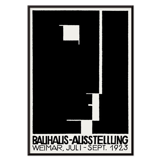
Bauhaus-Ausstellung Poster
Unbekannter Künstler · 1923 · Bauhaus-Ausstellung Poster mit markanter schwarz-weißer Geometrie und serifenfreier Typografie
Poster ab €9 · Gerahmt ab €16
Normaler Preis Von €6,00Normaler Preis -
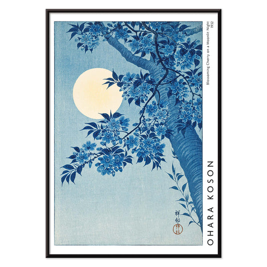
Blühende Kirschblüte in mondbeschienener Nacht Poster
Ohara Koson · 1932 · Mondbeschienene Kirschblüten Kunstdruck mit leuchtendem Vollmond und ruhiger blauer Nacht
Poster ab €9 · Gerahmt ab €16
Normaler Preis Von €6,00Normaler Preis -
Yatsuo no Tsubaki Poster
Taguchi Tomoki · 1865 · Ruhiger Vintage-Druck mit Kamelie und Vogel in klassischer japanischer Holzschnittkomposition
Poster ab €9 · Gerahmt ab €16
Normaler Preis Von €6,00Normaler Preis -
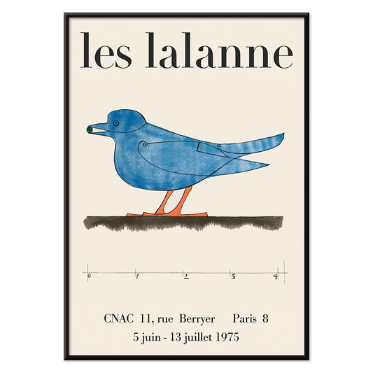
Les Lalanne Poster
François-Xavier Lalanne · 1975 · Minimalistisches Ausstellungsposter mit stilisiertem blauen Vogel auf beigem Grund
Poster ab €9 · Gerahmt ab €16
Normaler Preis Von €6,00Normaler Preis -
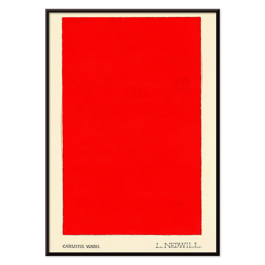
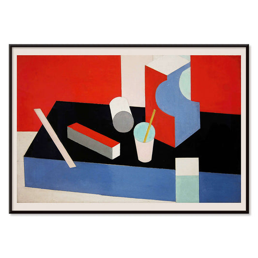
Carmine Wash Poster
Elizabeth A. Nedwill · 1900 · Minimalistischer abstrakter Kunstdruck mit einem einzelnen karminroten Block auf elfenbeinfarbenem Hintergrund
Poster ab €9 · Gerahmt ab €16
Normaler Preis Von €6,00Normaler Preis -
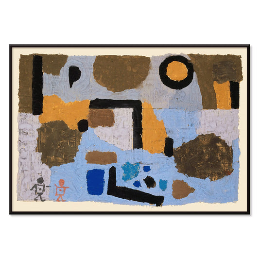
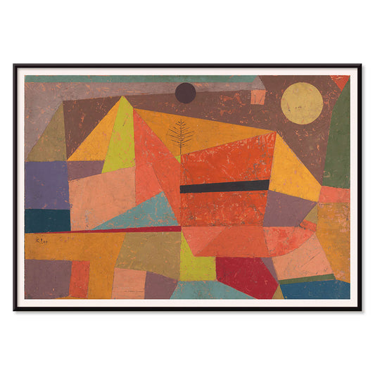
Die zwei Verlorenen Poster
Paul Klee · 1938 · Traumhafte abstrakte Figuren im Kunstdruck, feine Linien und stille Symbolik
Poster ab €9 · Gerahmt ab €16
Normaler Preis Von €6,00Normaler Preis -
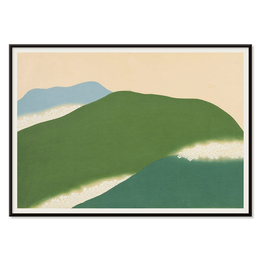
Yoshino Poster
Kamisaka Sekka · 1909 · Ruhiges japanisches Poster mit abstrakten grünen und blauen Hügeln auf warmem Beige
Poster ab €9 · Gerahmt ab €16
Normaler Preis Von €6,00Normaler Preis -
Kabuki Poster
Ikko Tanaka · 1974 · Minimalistisches Kabuki-Masken-Poster mit kräftigen schwarzen Formen und feinem beigen Negativraum
Poster ab €9 · Gerahmt ab €16
Normaler Preis Von €6,00Normaler Preis -
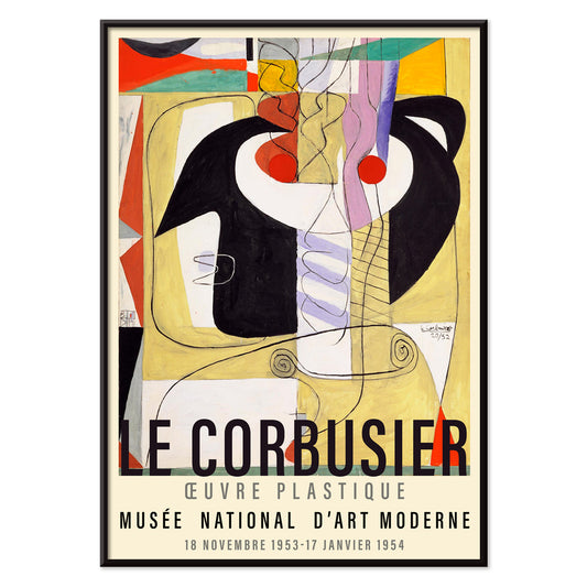
Métamorphose du violon Poster
Le Corbusier · 1920 · Modernistisches Poster, das Instrumentkurven in klare geometrische Rhythmen und kräftige Primärfarben übersetzt
Poster ab €9 · Gerahmt ab €16
Normaler Preis Von €6,00Normaler Preis -
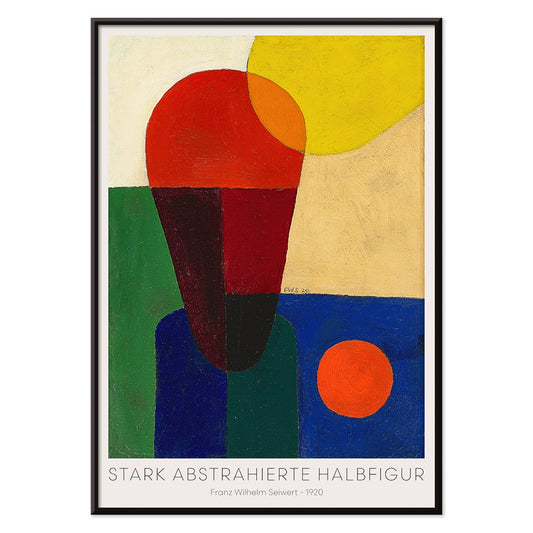
Stark abstrahierte Halbfigur Poster
Franz Wilhelm Seiwert · 1920 · Geometrischer Halbfiguren-Kunstdruck mit kräftigen Primärflächen und präzisem modernistischem Rhythmus
Poster ab €9 · Gerahmt ab €16
Normaler Preis Von €6,00Normaler Preis -
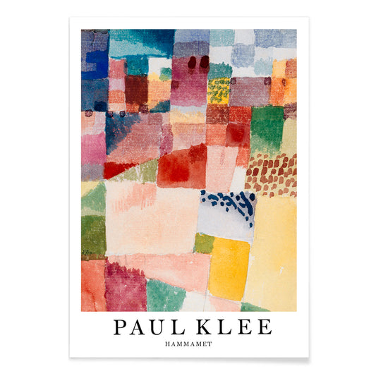
Hammamet Poster
Paul Klee · 1914 · Strahlender Kunstdruck mit mosaikartigen Feldern in Rot, Blau und Gelb
Poster ab €9 · Gerahmt ab €16
Normaler Preis Von €6,00Normaler Preis -
Komposition in Rot Blau Grün Gelb Poster
Wassily Kandinsky · 1913 · Lebendiger Kunstdruck mit geschichteten Kreisen, Winkeln und kräftigen Primärfarbakzenten
Poster ab €9 · Gerahmt ab €16
Normaler Preis Von €6,00Normaler Preis -
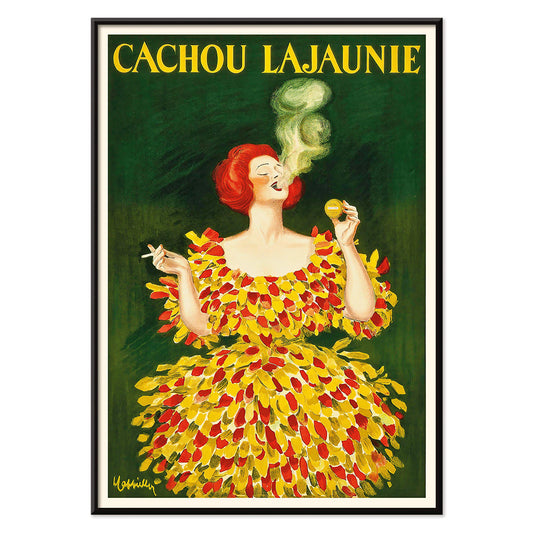
Cachou Lajaunie Poster
Leonetto Cappiello · 1920 · Ikonisches französisches Werbeposter mit rotgewandeter Frau und wirbelndem gelben Rauch
Poster ab €9 · Gerahmt ab €16
Normaler Preis Von €6,00Normaler Preis -
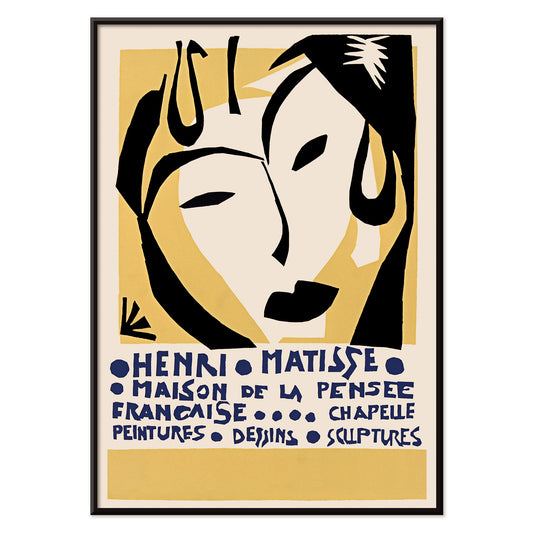
Maison de la Pensée française Poster
Henri Matisse · 1950 · ausdrucksstarkes Ausstellungsposter mit maskenhaftem Gesicht und blauer Typografie
Poster ab €9 · Gerahmt ab €16
Normaler Preis Von €6,00Normaler Preis -
Matisse Ausstellung Poster
Unbekannter Künstler · 1980 · Minimalistisches Ausstellungsplakat mit tanzender Figur in schwarzer Linie und kräftiger roter Typografie
Poster ab €9 · Gerahmt ab €16
Normaler Preis Von €6,00Normaler Preis -
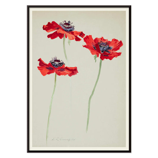
Drei Mohnblumen-Studien Poster
Sophia Crownfield · 1900 · Feiner botanischer Kunstdruck mit drei Mohnstudien, lebendige Blüten und filigrane Stängel
Poster ab €9 · Gerahmt ab €16
Normaler Preis Von €6,00Normaler Preis -
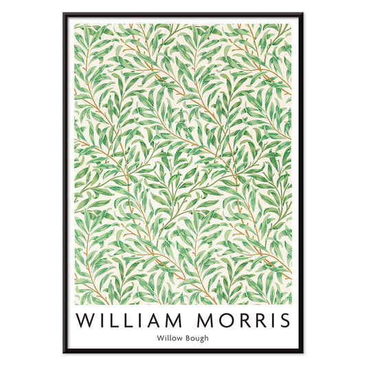
Weidenzweig Poster
William Morris · 1887 · Fließender Kunstdruck mit Weidenzweigen, eleganter Arts-and-Crafts-Ästhetik und harmonischem, ruhigem Rhythmus
Poster ab €9 · Gerahmt ab €16
Normaler Preis Von €6,00Normaler Preis -
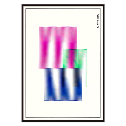
Rot, Blau, Grün Poster
W. Soya · 1964 · Geometrisches Farbflächen-Poster mit klaren Linien und kräftigen Rot-, Blau- und Grünkontrasten
Poster ab €9 · Gerahmt ab €16
Normaler Preis Von €6,00Normaler Preis -
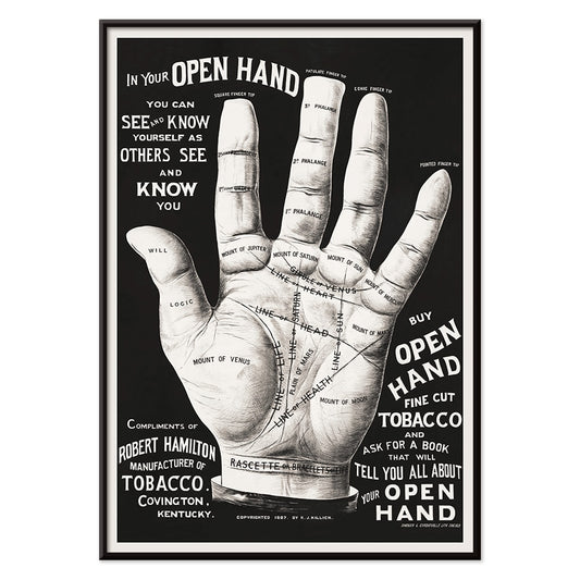
Handlesen Poster
J. Halleck · 1887 · Detailliertes Poster zur Handlese mit feinen schwarz-weißen Diagrammlinien und nüchterner Ästhetik
Poster ab €9 · Gerahmt ab €16
Normaler Preis Von €6,00Normaler Preis -
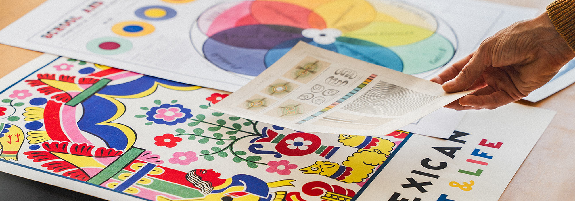
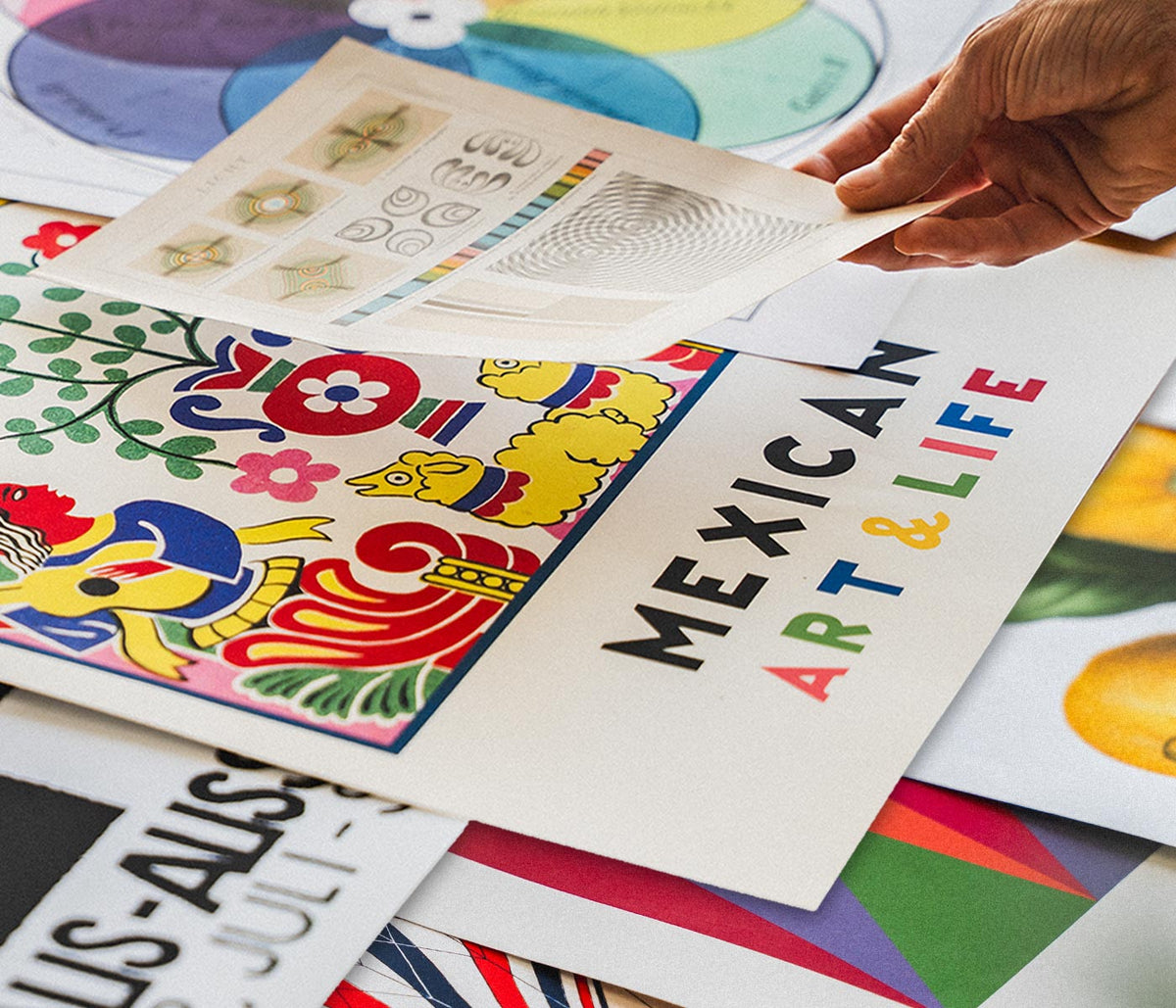
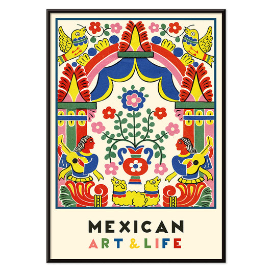
Mexikanische Kunst und Leben 1 Poster
Unbekannter Künstler · 1938 · Lebhaftes modernistisches mexikanisches Poster mit markanter volksinspirierter Geometrie und intensiver Farbigkeit
Poster ab €9 · Gerahmt ab €16
Normaler Preis Von €6,00Normaler Preis -
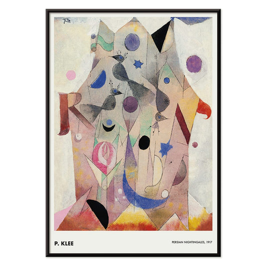
Persische Nachtigallen Poster
Paul Klee · 1917 · Traumhafte Vogelgestalten und juwelenhafte Farbtöne in einem abstrakten Kunstdruck
Poster ab €9 · Gerahmt ab €16
Normaler Preis Von €6,00Normaler Preis -
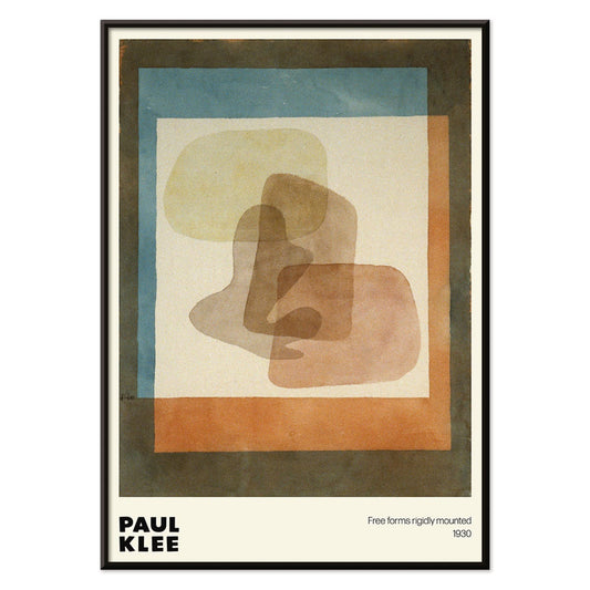
Freiformen Poster
Paul Klee · 1930 · Verspieltes abstraktes Poster mit freier Geometrie und blauen sowie orangen Akzenten
Poster ab €9 · Gerahmt ab €16
Normaler Preis Von €6,00Normaler Preis -
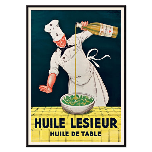
Huile Lesieur Poster
Leonetto Cappiello · 1930 · Schwungvolles Werbeposter mit fröhlichem Koch, der goldenes Öl über schwarzem Grund gießt
Poster ab €9 · Gerahmt ab €16
Normaler Preis Von €6,00Normaler Preis -
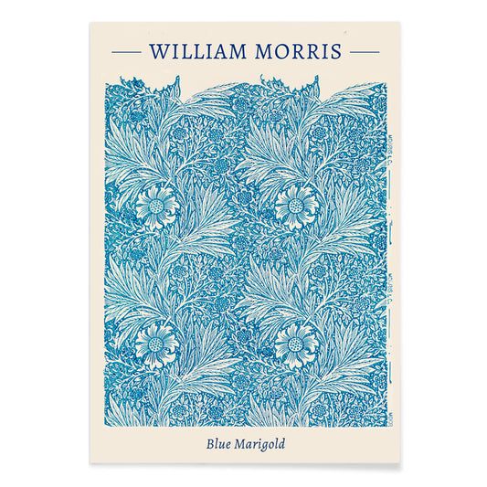
Blaue Ringelblume Poster
William Morris · 1875 · Detaillierter blauer Kunstdruck im rhythmischen Arts-and-Crafts-Muster mit stilisierten Ringelblumen
Poster ab €9 · Gerahmt ab €16
Normaler Preis Von €6,00Normaler Preis -
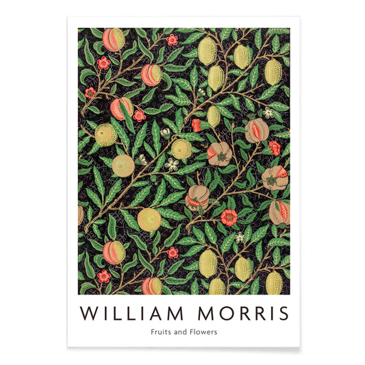
Fruchtmuster Poster
William Morris · 1862 · Üppiger Frucht- und Blattmuster-Kunstdruck mit rhythmischen Ranken auf dunklem Grund
Poster ab €9 · Gerahmt ab €16
Normaler Preis Von €6,00Normaler Preis -
Komposition Poster
Otto Freundlich · 1936 · Lebhafter geometrischer Kunstdruck mit ineinandergreifenden Farbflächen und kräftiger modernistischer Energie
Poster ab €9 · Gerahmt ab €16
Normaler Preis Von €6,00Normaler Preis -
Der Blaue Reiter Poster
Wassily Kandinsky · 1914 · Expressives abstraktes Poster mit markanter blauer Reiter-Silhouette und leuchtenden Farbflächen
Poster ab €9 · Gerahmt ab €16
Normaler Preis Von €6,00Normaler Preis -
Tropische Blumen II Poster
Unbekannter Künstler · 1912 · Dekorativer tropischer Blumendruck mit stilisiertem Blattwerk und warmem, elegantem Musterrhythmus
Poster ab €9 · Gerahmt ab €16
Normaler Preis Von €6,00Normaler Preis -
The Afternoon Poster
Henri Matisse · 1941 · minimalistischer Kunstdruck einer liegenden Figur vor schwarzem Grund
Poster ab €9 · Gerahmt ab €16
Normaler Preis Von €6,00Normaler Preis -
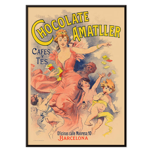
Chocolate Amatller Poster
Unbekannter Künstler · 1893 · lebendiger Vintage-Druck zu Chocolate Amatller mit Barcelonas heiterer Werbekultur
Poster ab €9 · Gerahmt ab €16
Normaler Preis Von €6,00Normaler Preis -
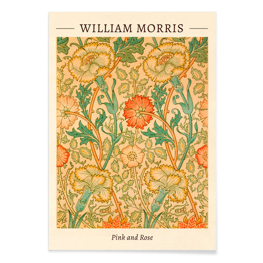
Pink and Rose Poster
William Morris · 1883 · Üppiger floraler Kunstdruck mit verschlungenen Rosen und Blattwerk in warmen Vintage-Tönen
Poster ab €9 · Gerahmt ab €16
Normaler Preis Von €6,00Normaler Preis -
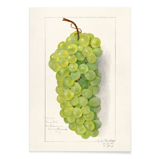
Traubenrispe Poster
Amanda Almira Newton · 1896 · Zarter botanischer Kunstdruck mit grüner Traubenrispe, durchscheinender Haut und sanften Schatten
Poster ab €9 · Gerahmt ab €16
Normaler Preis Von €6,00Normaler Preis -
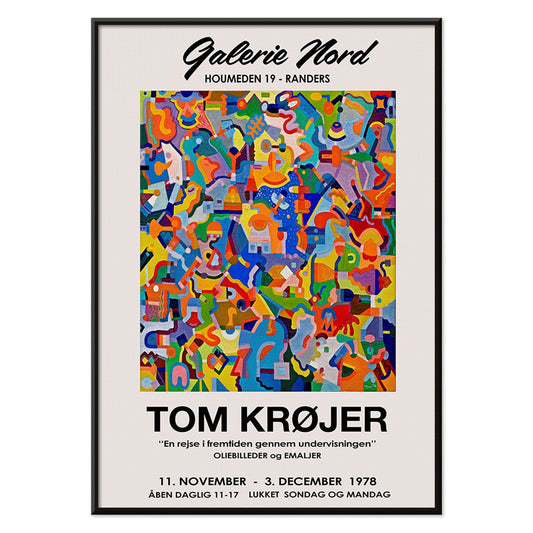
Tom Krojer Ausstellungs-Poster
Tom Krojer · 1989 · Dynamisches Ausstellungs-Poster mit geometrischen Farbflächen und präziser moderner Typografie
Poster ab €9 · Gerahmt ab €16
Normaler Preis Von €6,00Normaler Preis -
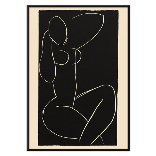
Sitzender Akt mit gekreuzten Beinen I Poster
Henri Matisse · 1941 · minimalistischer Kunstdruck eines sitzenden Akts mit gekreuzten Beinen
Poster ab €9 · Gerahmt ab €16
Normaler Preis Von €6,00Normaler Preis -
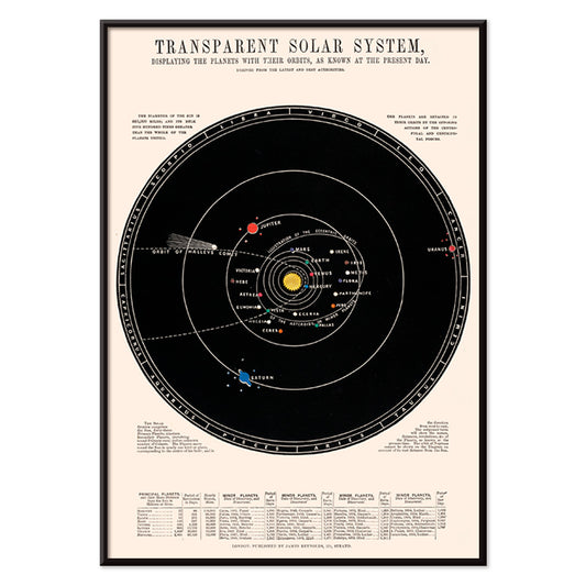
Transparentes Sonnensystem Poster
James Reynolds · 1851 · Detaillierter wissenschaftlicher Druck des Sonnensystems mit beschrifteten Umlaufbahnen und handkolorierten Akzenten
Poster ab €9 · Gerahmt ab €16
Normaler Preis Von €6,00Normaler Preis -
Farbstudien, 10 Blätter VI Poster
Karl Wiener · 1923 · Lebhafter Kunstdruck mit orange-blauen und grünen Formen auf warmem Beige
Poster ab €9 · Gerahmt ab €16
Normaler Preis Von €6,00Normaler Preis -
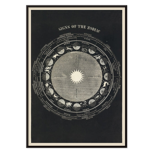
Sternzeichen Poster
Asa Smith · 1850 · Detaillierter Sternzeichen-Druck mit Sternbild-Emblemen, präziser viktorianischer Linienführung und klarer Gliederung
Poster ab €9 · Gerahmt ab €16
Normaler Preis Von €6,00Normaler Preis -
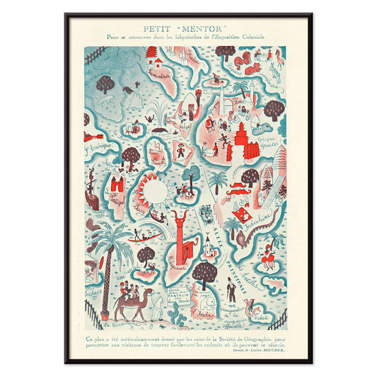
Petit Mentor Poster
Lucien Boucher · 1931 · Verspieltes Art-Deco-Poster mit präzisen Beschriftungen und lebhaften Illustrationsdetails in warmen Tönen
Poster ab €9 · Gerahmt ab €16
Normaler Preis Von €6,00Normaler Preis -
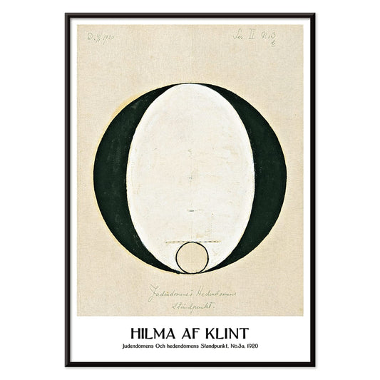
Standpunkt Judentum und Heidentum Poster
Hilma af Klint · 1920 · Mystischer geometrischer Kunstdruck mit klaren schwarzen Symbolen auf ruhigem beigen Grund
Poster ab €9 · Gerahmt ab €16
Normaler Preis Von €6,00Normaler Preis -
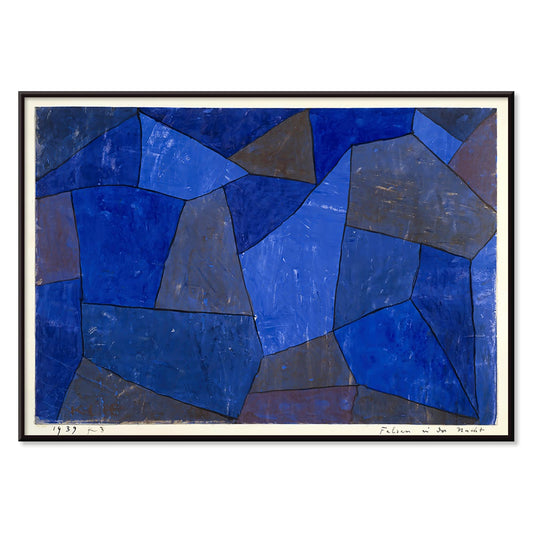
Rocks at Night Poster
Paul Klee · 1939 · Traumhafter abstrakter Kunstdruck mit gestapelten blauen Formen, die Felsen der Nacht suggerieren
Poster ab €9 · Gerahmt ab €16
Normaler Preis Von €6,00Normaler Preis -
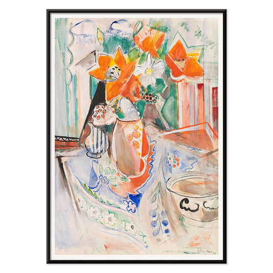
Blumenstillleben mit Schale Poster
Oskar Moll · 1902 · Lebhaftes Blumenstillleben-Poster, das einen kräftigen Blumenstrauß mit einer schlichten Schale ausbalanciert
Poster ab €9 · Gerahmt ab €16
Normaler Preis Von €6,00Normaler Preis -
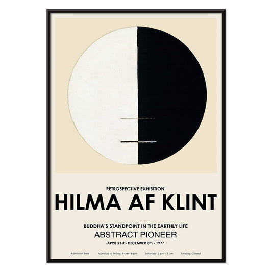
Buddhas Standpunkt im irdischen Leben Poster
Hilma af Klint · 1917 · Meditativer abstrakter Kunstdruck mit buddhistischer Symbolik in ruhigem Kreisdiagramm
Poster ab €9 · Gerahmt ab €16
Normaler Preis Von €6,00Normaler Preis -
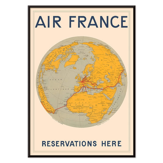
Air France Poster
E. Giraud · 1938 · Art-Deco-Weltkarte als Poster mit markanten Air France-Routen in kräftigen roten Linien
Poster ab €9 · Gerahmt ab €16
Normaler Preis Von €6,00Normaler Preis -
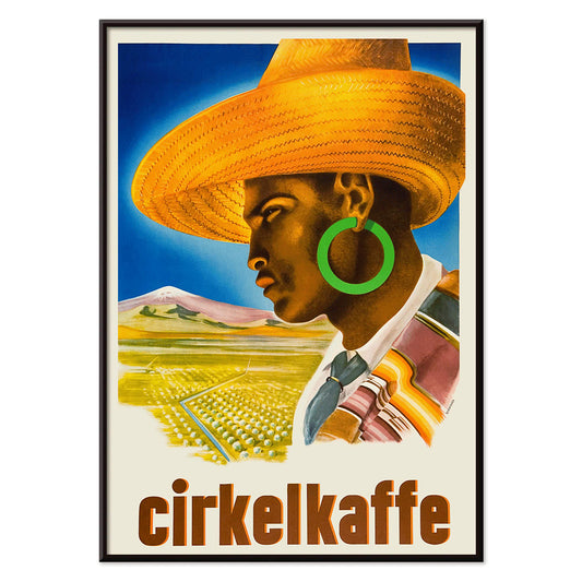
Mann mit Hut Cirkelkaffe Poster
J.Olséns · 1945 · Grafisches Kaffee-Poster mit Figur im breitkrempigen Hut vor ländlicher grüner Landschaft
Poster ab €9 · Gerahmt ab €16
Normaler Preis Von €6,00Normaler Preis -
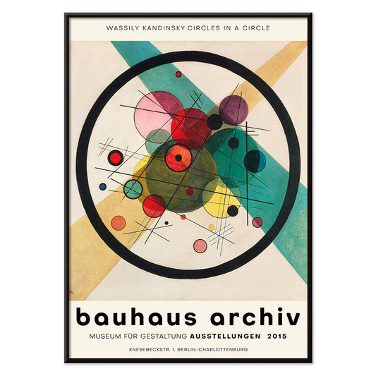
Kreise im Kreis Poster
Wassily Kandinsky · 1923 · Strahlendes abstraktes Poster mit übereinanderliegenden Kreisen auf tiefschwarzem Grund und dynamischer Geometrie
Poster ab €9 · Gerahmt ab €16
Normaler Preis Von €6,00Normaler Preis -
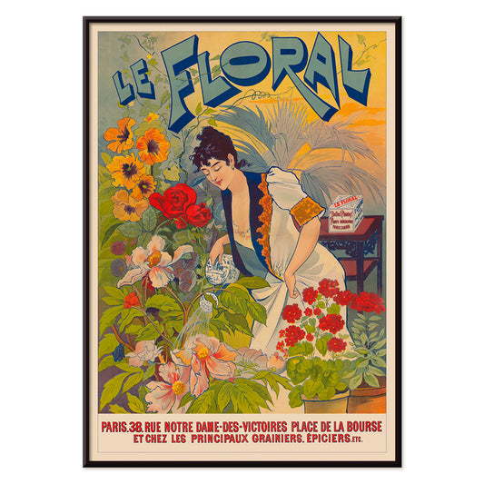
Le Floral Poster
Unbekannter Künstler · 1891 · Graziöses Jugendstil-Poster mit Frau zwischen bunten Blumen und ornamentaler Schrift
Poster ab €9 · Gerahmt ab €16
Normaler Preis Von €6,00Normaler Preis -
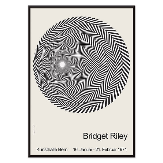
Riley Blaze Poster
Bridget Riley · 1964 · Hypnotischer schwarz-weiß Op-Art-Poster mit geschwungenen Bändern, die zu pulsieren scheinen
Poster ab €9 · Gerahmt ab €16
Normaler Preis Von €6,00Normaler Preis -
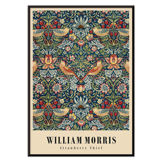
Strawberry Thief Poster
William Morris · 1883 · Ikonisches Arts-and-Crafts-Poster mit Drosseln, Erdbeeren und Ranken in satten Blautönen
Poster ab €9 · Gerahmt ab €16
Normaler Preis Von €6,00Normaler Preis -
Karte eines Frauenherzens 2 Poster
Joseph Husson · 1840 · romantisches Kartenposter mit herzförmigen Pastellgebieten, diagonalem Pfeil und feiner Beschriftung
Poster ab €9 · Gerahmt ab €16
Normaler Preis Von €6,00Normaler Preis -
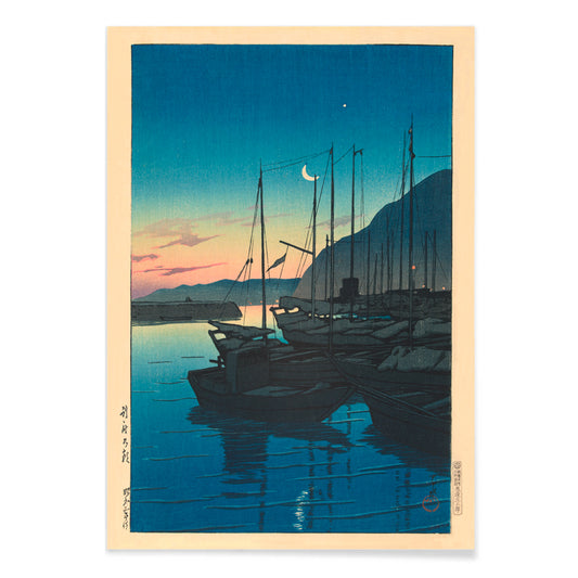
Morgen in Beppu Poster
Kawase Hasui · 1937 · Ruhiger Hafen bei Sonnenaufgang als Kunstdruck mit Booten, Dunst und leuchtenden Spiegelungen
Poster ab €9 · Gerahmt ab €16
Normaler Preis Von €6,00Normaler Preis -
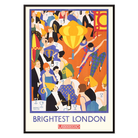
Hellstes London Poster
Horace Taylor · 1924 · Lebendiges Poster des Londoner Nachtlebens mit leuchtenden Lichtern und klarer Underground-Schrift
Poster ab €9 · Gerahmt ab €16
Normaler Preis Von €6,00Normaler Preis -
Kubik Poster
Patrick Henry Bruce · 1917 · Geometrischer kubistischer Kunstdruck mit ineinandergreifenden Flächen in Rot, Blau, Schwarz und Weiß
Poster ab €9 · Gerahmt ab €16
Normaler Preis Von €6,00Normaler Preis -
Mexican Art & Life 3 Poster
Unbekannter Künstler · 1938 · Modernistisches Waldposter mit verspielten Tieren und markanter Mexican Art & Life Typografie
Poster ab €9 · Gerahmt ab €16
Normaler Preis Von €6,00Normaler Preis -
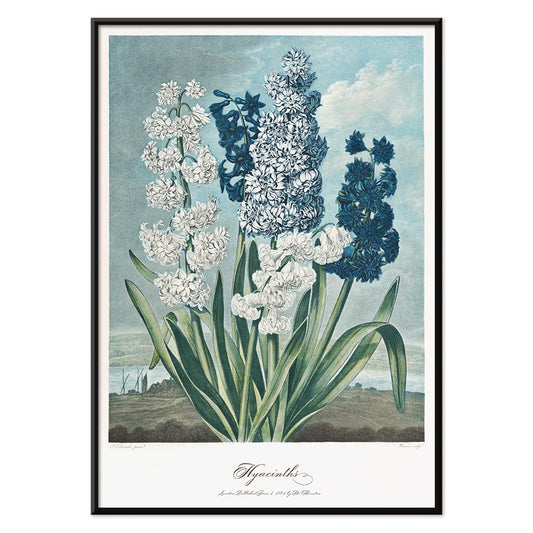
Hyazinthen Poster
Robert John Thornton · 1807 · Eleganter botanischer Kunstdruck mit zarten Blüten und skulpturalen grünen Blättern
Poster ab €9 · Gerahmt ab €16
Normaler Preis Von €6,00Normaler Preis -
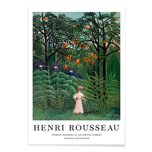
Frau im exotischen Wald Poster
Henri Julien Félix Rousseau · 1905 · Naiver Kunstdruck einer Frau in üppigem tropischem Dschungel
Poster ab €9 · Gerahmt ab €16
Normaler Preis Von €6,00Normaler Preis -
Fröhlicher Berg Poster
Paul Klee · 1929 · Fröhlicher abstrakter Berg-Kunstdruck aus rhythmischen Farbflächen und feinen schwarzen Linien
Poster ab €9 · Gerahmt ab €16
Normaler Preis Von €6,00Normaler Preis


72/203 items
- The Endless Summer Poster
- Le Siniolchu Poster
- Coffea arabica Poster
- Bauhaus 21 Poster
- The Grand Tour Poster
- Farbstudien, 10 Blätter VIII Poster
- Nickerson Paine im Bikini Poster
- Die Zehn Größten Nr. 8 Poster
- Le rêve Poster
- Hibiskus Poster
- The New Yorker 2 Poster
- Bunte Mehrfachsterne Poster
- Meeresleben Poster
- Rote und grüne Tomaten Poster
- Entwurf eines Wandbilds Poster
- Le Ciel Poster
- Bauhaus-Ausstellung Poster
- Blühende Kirschblüte in mondbeschienener Nacht Poster
- Yatsuo no Tsubaki Poster
- Les Lalanne Poster
- Carmine Wash Poster
- Die zwei Verlorenen Poster
- Yoshino Poster
- Kabuki Poster
- Métamorphose du violon Poster
- Stark abstrahierte Halbfigur Poster
- Hammamet Poster
- Komposition in Rot Blau Grün Gelb Poster
- Cachou Lajaunie Poster
- Weidenzweig Poster
- Rot, Blau, Grün Poster
- Handlesen Poster
- Mexikanische Kunst und Leben 1 Poster
- Persische Nachtigallen Poster
- Freiformen Poster
- Huile Lesieur Poster
- Blaue Ringelblume Poster
- Fruchtmuster Poster
- Komposition Poster
- Der Blaue Reiter Poster
- Tropische Blumen II Poster
- Pink and Rose Poster
- Traubenrispe Poster
- Tom Krojer Ausstellungs-Poster
- Sternzeichen Poster
- Petit Mentor Poster
- Standpunkt Judentum und Heidentum Poster
- Air France Poster
- Mann mit Hut Cirkelkaffe Poster
- Kreise im Kreis Poster
- Le Floral Poster
- Riley Blaze Poster
- Strawberry Thief Poster
- Morgen in Beppu Poster
- Hellstes London Poster
- Kubik Poster
- Mexican Art & Life 3 Poster
- Frau im exotischen Wald Poster
- Fröhlicher Berg Poster
Eine kuratorische Quersicht durch die Plakatkultur
Unsere Auswahl versammelt Bildwelten, die einst an Straßenecken, Schaufenstern und auf Galeriewänden lebten und gelernt haben, sich im Wohnraum zu fügen. Es handelt sich nicht um eine einzelne Strömung, sondern um ein Gespräch zwischen Vintage-Poster-Design, modernen Kunstdrucksensibilitäten und dokumentarischer Fotografie. Der rote Faden ist Lesbarkeit und Stimmung: Arbeiten, die aus der Distanz klar wirken und bei näherer Betrachtung mit Papierkorn, Rasterkanten und zurückgenommener Gestik belohnen. Für einen breiteren Überblick zu Formaten und Epochen hilft der Hauptindex Alle Poster, diese Auswahl einzuordnen.
Designgeschichte im Kleinen, von Lithographie bis Fotorastersieb
Klassische Plakate sind auf Aufmerksamkeit getrimmt, weshalb ihre Kompositionen oft entschlossen sind: reduzierte Formen, hoher Kontrast und Typografie, die sich gegen den Lärm der Stadt behauptet. Viele unvergessliche Beispiele basieren auf Lithographie, bei der separate Farbsteine flächige Felder erzeugten, die bis heute frisch wirken. Spätere Verfahren brachten Halbtonpunkte und fotografisches Korn ein und schufen eine andere Textur und Wirklichkeit. Wer Struktur und reduzierte Form schätzt, findet eine Verwandtschaft zur Sprache Abstrakt; wer eine leisere, beobachtende Wirkung sucht, wird in Fotografie fündig. Eine nervösere, handschriftliche Linie zeigt sich bei Egon Schiele, wo Zeichnung ebenso Psychologie wie Abbildung wird.
Platzierung im Raum: die Auswahl zimmerweise nutzen
Da die Auswahl mehrere Bildregister umfasst, funktioniert sie am besten, wenn der Raum die Lautstärke vorgibt. In Wohnräumen mit Eiche, Leinen oder Bouclé wählen Sie ein Vintage-Poster mit weicheren Pigmenten oder warmem Papierton, damit die Wandkunst integriert statt laut wirkt. Flure profitieren von vertikaler Betonung und wiederkehrenden Intervallen, weshalb Vertikale Poster Rhythmus stiften können. In Küchen und Essnischen erscheinen schärfere Typografien und botanische Details natürlich; die Kombination mit Botanik hält die Palette in Grün- und Offwhite-Tönen geerdet. Für Schlafzimmer empfehlen sich geringerer Kontrast und ruhigere Staffelung oder die tonale Disziplin von Schwarz-Weiß, um das Licht sanft zu halten.
Eine Galeriewand kuratieren, ohne Harmonie zu erzwingen
Gute Dekoration lebt von Rhythmus: ein markantes Bild, mehrere leisere, und ein wiederkehrendes Element, das die Gruppe verbindet, etwa eine einzelne Tintenfarbe oder eine gemeinsame Randbreite. Praktisch ist es, die Gruppe mit einem typografischen oder emblematischen Blatt zu verankern und ein Foto oder Landschaftsfragment als weicheres Gegengewicht hinzuzufügen. Für stärkere grafische Akzente eignet sich ein Bezug aus Werbung; für museumshafte Langsamkeit greifen Sie zu einem Blatt aus Klassische Kunst. Die Rahmenwahl nimmt die finale Kürzung vor: helles Holz hebt warme Paletten, schwarzes Metall schärft Linien, und ein großzügiger Passepartout macht gealtertes Papier bewusst. Ein einfacher Weg ist, Rahmen konsistent zu halten und die Bildwahl variieren zu lassen, dann den Abstand so zu justieren, dass der Negativraum Teil der Komposition wird.
Eine Auswahl, die mit Ihren Räumen wachsen kann
Die Stärke von Unsere Auswahl liegt in ihrer Offenheit: Sie verhält sich wie ein persönliches Archiv, das neu sequenziert werden kann, wenn Möbel wandern und Farbentscheidungen reifen. Manche Haushalte bewahren die Mischung eklektisch; andere lenken sie schrittweise auf ein Jahrzehnt, ein Thema oder einen dominanten Farbton. So oder so wurden Poster- und Drucksprachen hier fürs Nebeneinander geschaffen, und die überzeugendsten Galeriewände wirken angesammelt statt geplant.