


- Tour Eiffel 2 Poster
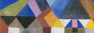
- Bauhaus 21 Poster
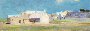
- Campanile di Pisa Poster
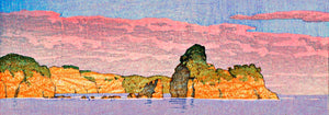
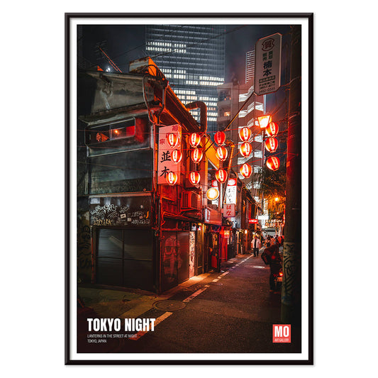
- Tokyo Night Poster
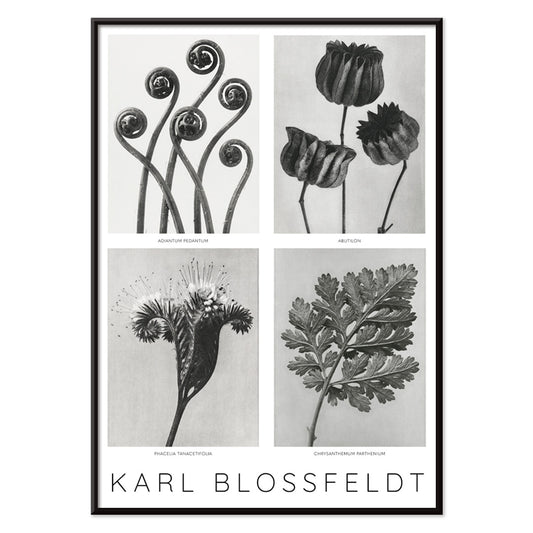
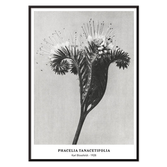
- Phacelia tanacetifolia Poster
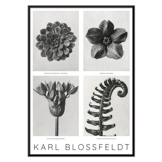
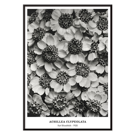
- Achillea Clypeolata Poster
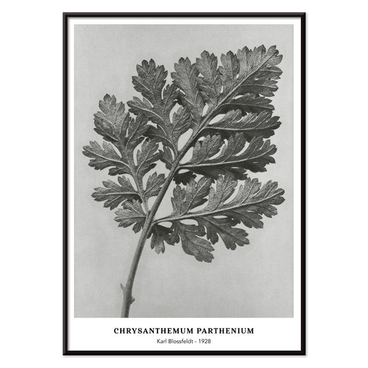
- Chrysanthemum parthenium Poster
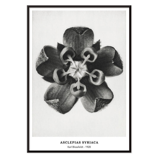
- Asclepias Syriaca Poster
- Cirsium Canum Poster
- USA: New York Poster
- Street of Barcelona Poster
- View of Barcelona Poster
- Geological map of the world Poster
- Asa–dsuma–bune Poster
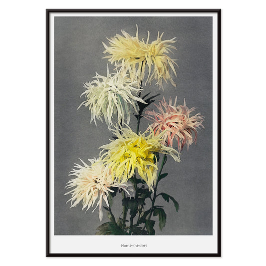
- Nami–chi–dori Poster
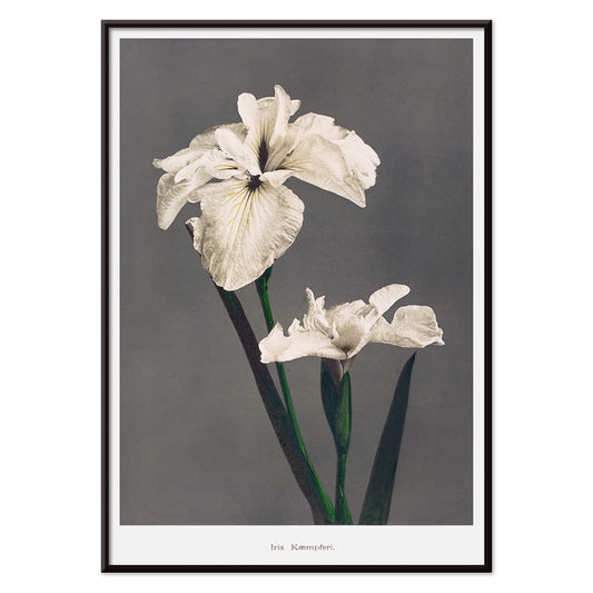
- Iris Kæmpferi Poster
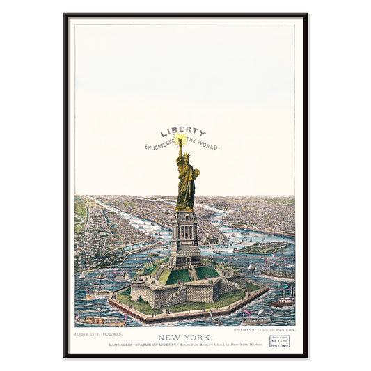
- The Great Bartholdi Statue Poster
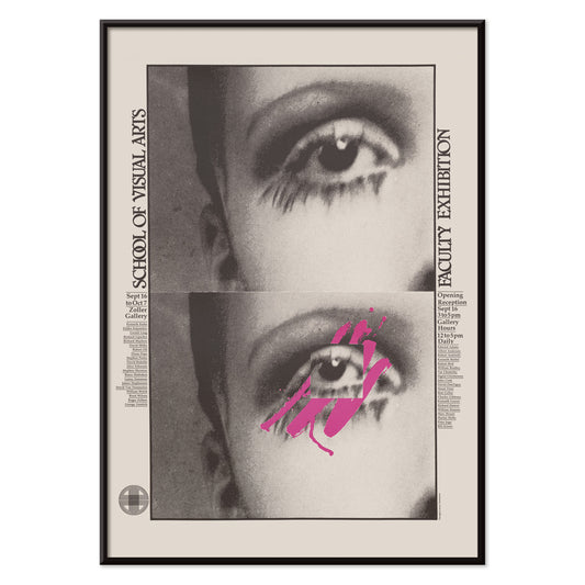
- School of Visual Arts Poster
- Family Dogs Poster
- Female Lion Poster
- Magnolia Poster
- Antique statue head Poster
-
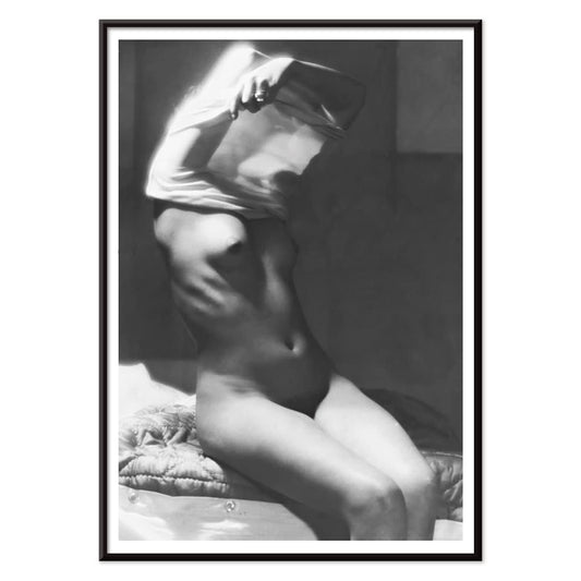
Before going to bed Poster
Michael Heumuller · 1950 · Intimate black-and-white bedroom poster with poised figure and cinematic evening shadows
Poster from €9 · Framed from €16
Regular price From €6,00Regular price -
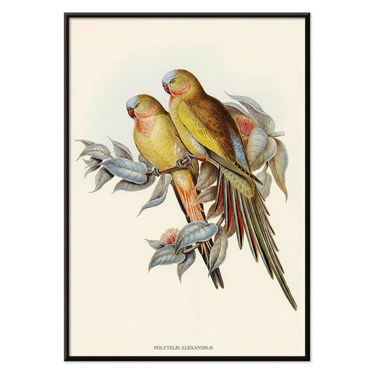
Polytelis Alexandrae Poster
Unknown artist · 1873 · Elegant parakeet print featuring two long-tailed birds in fresh green and rose hues
Poster from €9 · Framed from €16
Regular price From €6,00Regular price -
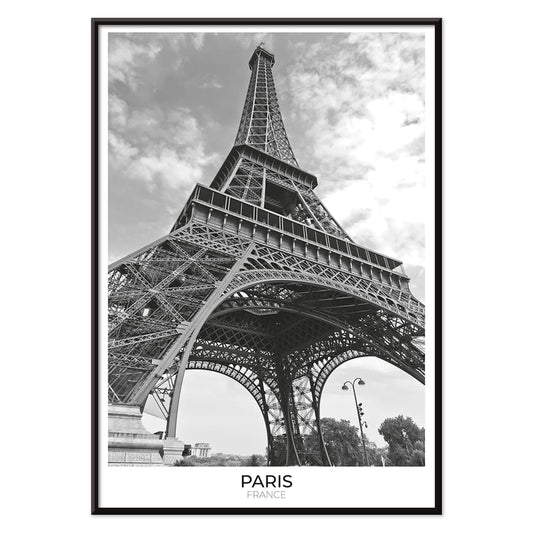
Tour Eiffel 2 Poster
Unknown artist · 1925 · Striking black-and-white Eiffel Tower poster with crisp iron latticework and Paris skyline
Poster from €9 · Framed from €16
Regular price From €6,00Regular price -
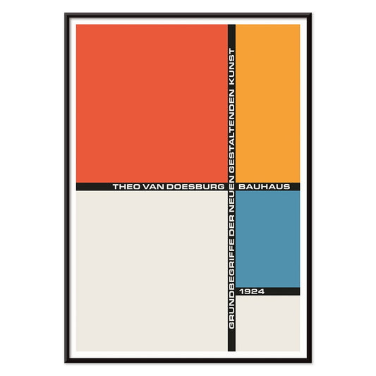
Bauhaus 21 Poster
Unknown artist · 1924 · Geometric Bauhaus poster with orange circle, blue block, and crisp black lines
Poster from €9 · Framed from €16
Regular price From €6,00Regular price -
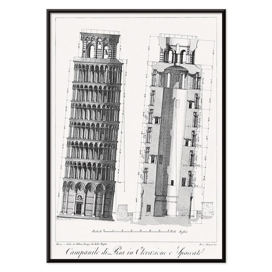
Campanile di Pisa Poster
G.L. Taylor · 1837 · Precise architectural print of the Leaning Tower of Pisa in crisp monochrome
Poster from €9 · Framed from €16
Regular price From €6,00Regular price -
Les Palmiers Histoire Iconographique 1 Poster
Oswald de Kerchove de Denterghem · 1878 · Detailed palm botanical print with crisp linework and calm natural history elegance
Poster from €9 · Framed from €16
Regular price From €6,00Regular price -
Les Palmiers Histoire Iconographique 2 Poster
Oswald de Kerchove de Denterghem · 1878 · Elegant botanical print of a palm study arranged like a scientific plate
Poster from €9 · Framed from €16
Regular price From €6,00Regular price -
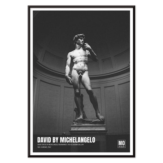
David of Michelangelo 2 Poster
Mo Art Gallery · 1504 · Monochrome David art print highlighting the sculpted gaze and marble texture
Poster from €9 · Framed from €16
Regular price From €6,00Regular price -
David of Michelangelo Poster
Mo Art Gallery · 1504 · Monochrome David sculpture poster emphasizing Renaissance form and marble detail
Poster from €9 · Framed from €16
Regular price From €6,00Regular price -
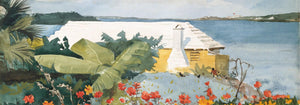
Tokyo Night Poster
Mo Art Gallery · 2022 · Atmospheric Tokyo street poster with lantern glow and sharp black-red contrast
Poster from €9 · Framed from €16
Regular price From €6,00Regular price -
Flowers Poster 2 Poster
Karl Blossfeldt · 1928 · Sculptural plant study print in crisp black and white with modernist clarity
Poster from €9 · Framed from €16
Regular price From €6,00Regular price -
Flowers Poster 1 Poster
Karl Blossfeldt · 1928 · Sculptural flower print in crisp black and white with laboratory clarity
Poster from €9 · Framed from €16
Regular price From €6,00Regular price -
Phacelia tanacetifolia Poster
Karl Blossfeldt · 1928 · Sculptural Phacelia study art print with crisp monochrome detail and rhythmic curves
Poster from €9 · Framed from €16
Regular price From €6,00Regular price -
Achillea Clypeolata Poster
Karl Blossfeldt · 1928 · Sculptural yarrow print in crisp black and white with architectural symmetry
Poster from €9 · Framed from €16
Regular price From €6,00Regular price -
Chrysanthemum parthenium Poster
Karl Blossfeldt · 1928 · Monochrome chrysanthemum leaf print balancing scientific clarity with quiet sculptural drama
Poster from €9 · Framed from €16
Regular price From €6,00Regular price -
Asclepias Syriaca Poster
Karl Blossfeldt · 1928 · Sculptural black-and-white milkweed print highlighting geometric buds against a clean studio background
Poster from €9 · Framed from €16
Regular price From €6,00Regular price -
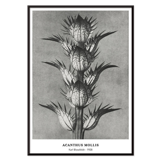
Acanthus mollis Poster
Karl Blossfeldt · 1928 · Sculptural acanthus print with sharp monochrome detail and museum like calm
Poster from €9 · Framed from €16
Regular price From €6,00Regular price -
Cirsium Canum Poster
Karl Blossfeldt · 1928 · Stark thistle print with sculptural botanical forms in crisp black and white
Poster from €9 · Framed from €16
Regular price From €6,00Regular price -
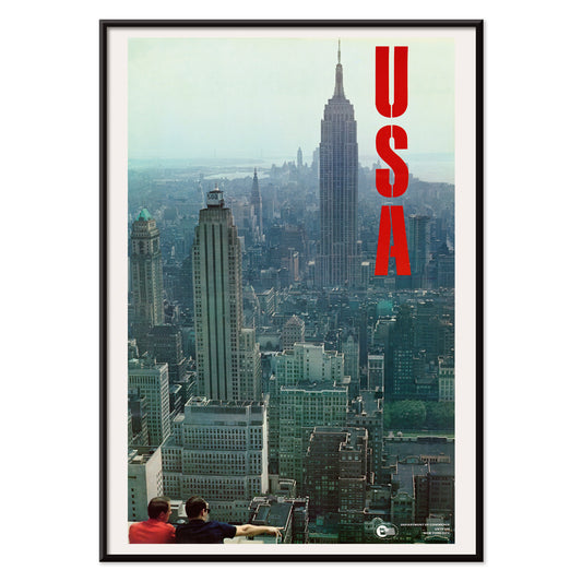
USA: New York Poster
U.S. Information Agency · 1955 · Mid-century New York skyline poster with bold typography and cool blue-grey silhouettes
Poster from €9 · Framed from €16
Regular price From €6,00Regular price -
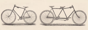
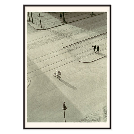
New Year’s Morning Poster
László Moholy-Nagy · 1930 · Bauhaus bicycle poster in crisp black and grey with kinetic street perspective
Poster from €9 · Framed from €16
Regular price From €6,00Regular price -
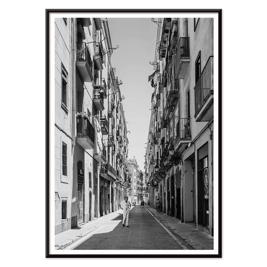
Street of Barcelona Poster
Unknown artist · 1910 · Atmospheric vintage print of a Barcelona street with deep shadows and bright stone facades
Poster from €9 · Framed from €16
Regular price From €6,00Regular price -
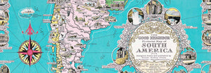
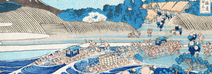
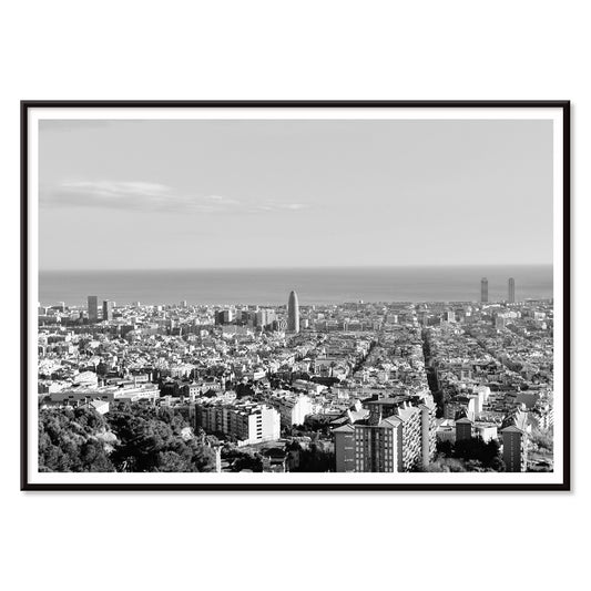
View of Barcelona Poster
Unknown artist · 1563 · Panoramic Barcelona vintage print featuring fortified shoreline, sailing ships, and distant hills
Poster from €9 · Framed from €16
Regular price From €6,00Regular price -
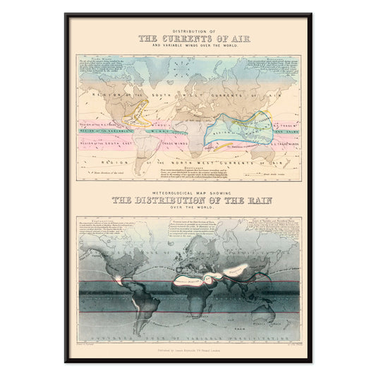
Air and Variable winds Poster
James Reynolds · 1854 · Global wind and air current vintage print with elegant arrows across oceans
Poster from €9 · Framed from €16
Regular price From €6,00Regular price -
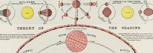
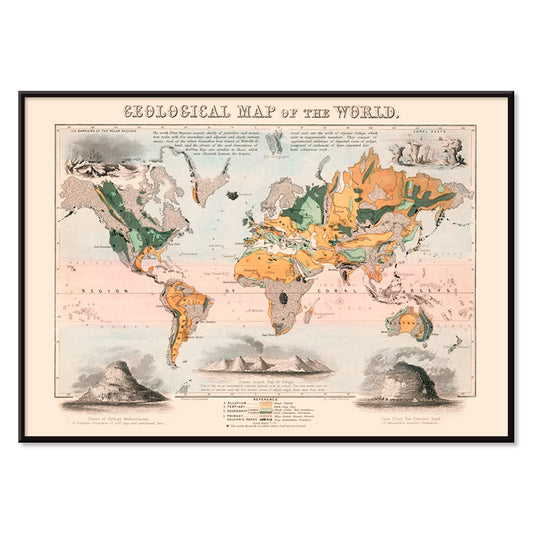
Geological map of the world Poster
James Reynolds · 1850 · Detailed world geology vintage print with color-coded strata and neat Victorian labels
Poster from €9 · Framed from €16
Regular price From €6,00Regular price -
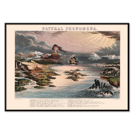
Natural Phenomena Poster
James Reynolds · 1852 · Detailed scientific print mapping volcanoes, lightning, clouds, and ocean currents in one scene
Poster from €9 · Framed from €16
Regular price From €6,00Regular price -
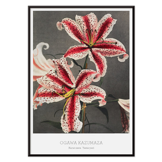
Lily Poster
Kazumasa Ogawa · 1896 · Delicate lily botanical print with hand-tinted petals and soft neutral background
Poster from €9 · Framed from €16
Regular price From €6,00Regular price -
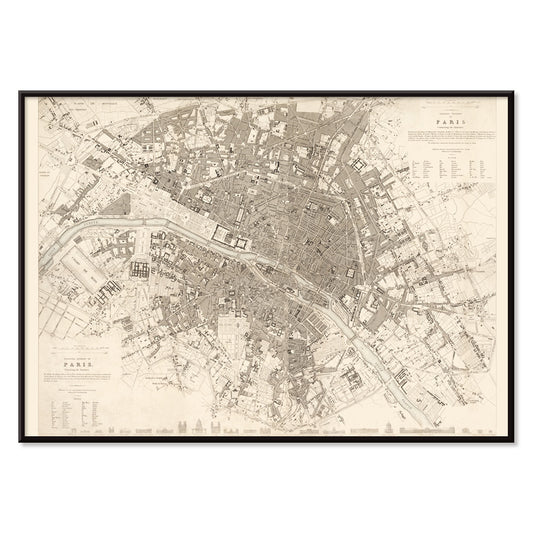
Eastern division of Paris Poster
James Shury · 1834 · Finely engraved Paris map poster with dense street detail and crisp black linework
Poster from €9 · Framed from €16
Regular price From €6,00Regular price -
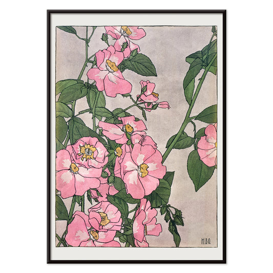
Prairie Rose Poster
Hannah Borger Overbeck · 1915 · Delicate prairie rose vintage print featuring soft pink blooms and gentle green foliage
Poster from €9 · Framed from €16
Regular price From €6,00Regular price -
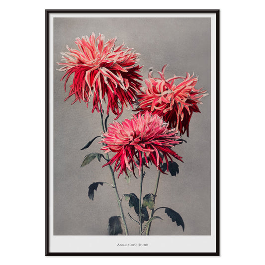
Asa–dsuma–bune Poster
Kazumasa Ogawa · 1896 · Hand-colored floral print featuring scarlet blossoms and crisp leaves against a quiet ground
Poster from €9 · Framed from €16
Regular price From €6,00Regular price -
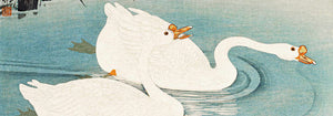
Nami–chi–dori Poster
Kazumasa Ogawa · 1896 · Elegant wave and plover poster with airy negative space and gentle coastal rhythm
Poster from €9 · Framed from €16
Regular price From €6,00Regular price -
Iris Kæmpferi Poster
Kazumasa Ogawa · 1896 · Delicate white iris botanical print with slender green leaves and spacious calm
Poster from €9 · Framed from €16
Regular price From €6,00Regular price -
The Great Bartholdi Statue Poster
Currier & Ives · 1885 · Patriotic New York Harbor poster with the Great Bartholdi Statue and bustling steamships
Poster from €9 · Framed from €16
Regular price From €6,00Regular price -
School of Visual Arts Poster
Lanny Sommese · 1979 · Graphic eye poster with black background and vivid pink accents for SVA
Poster from €9 · Framed from €16
Regular price From €6,00Regular price -
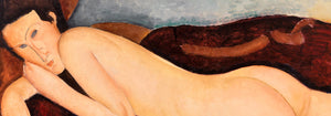
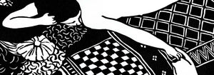
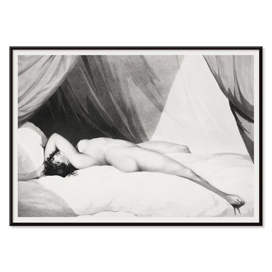
Nude on Curtained Bed Poster
William Holland · 1797 · Intimate black and white reclining nude art print framed by theatrical bed curtains
Poster from €9 · Framed from €16
Regular price From €6,00Regular price -
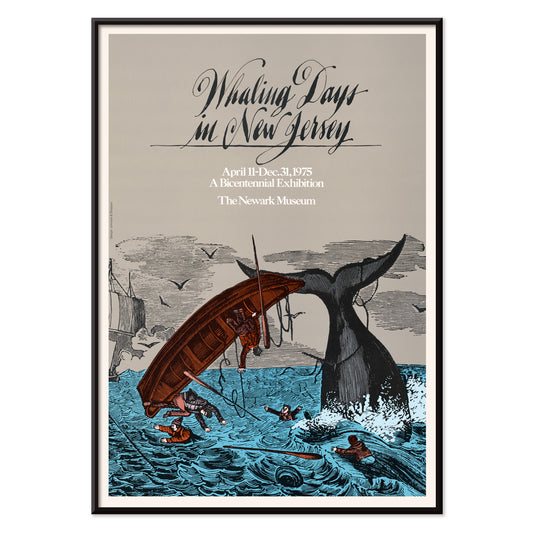
Whaling Days in New Jersey Poster
Unknown artist · 1975 · Dramatic maritime poster of a whaleboat facing a thrashing tail in rough seas
Poster from €9 · Framed from €16
Regular price From €6,00Regular price -
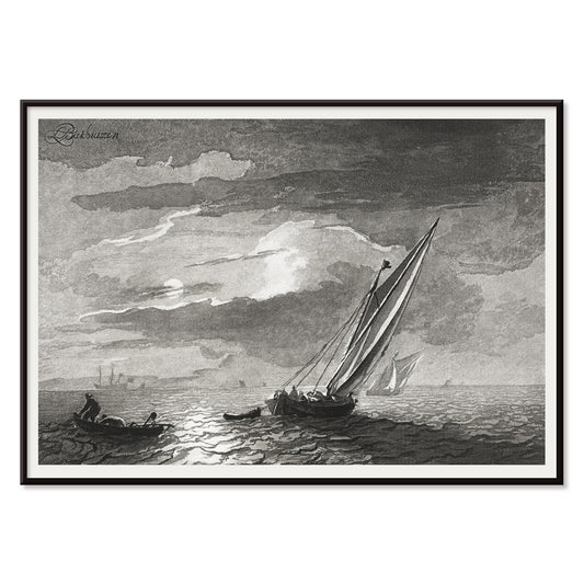
Seascape with full moon Poster
Cornelis Ploos van Amstel · 1780 · Moonlit seascape poster with silvery reflections and quiet sailing silhouettes
Poster from €9 · Framed from €16
Regular price From €6,00Regular price


- Tour Eiffel 2 Poster
- Bauhaus 21 Poster
- Campanile di Pisa Poster
- Tokyo Night Poster
- Phacelia tanacetifolia Poster
- Achillea Clypeolata Poster
- Chrysanthemum parthenium Poster
- Asclepias Syriaca Poster
- Cirsium Canum Poster
- USA: New York Poster
- Street of Barcelona Poster
- View of Barcelona Poster
- Geological map of the world Poster
- Asa–dsuma–bune Poster
- Nami–chi–dori Poster
- Iris Kæmpferi Poster
- The Great Bartholdi Statue Poster
- School of Visual Arts Poster
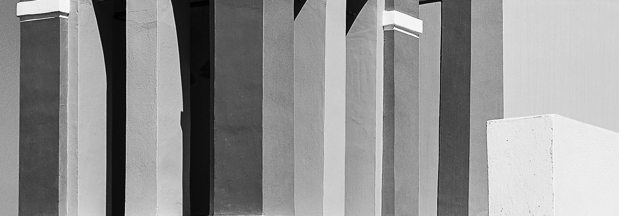
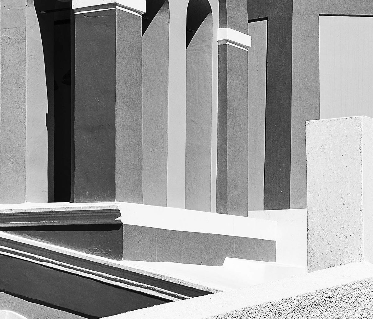
Grey as a design atmosphere
Grey rarely reads as a single colour on the wall. It shifts between graphite, pewter, fog, ash, and concrete, carrying the atmosphere of streets after rain or paper warmed by time. In vintage poster culture, grey often emerges through limited inks, photographic grain, or the deliberate restraint of modernist design. The result is wall art that feels architectural: less about spectacle, more about structure, surface, and the way light moves across a room.
Modernism and the discipline of restraint
Many twentieth-century artists used neutral tones to make form legible. In Wassily Kandinsky’s Four Parts (1932), muted colour keeps attention on the choreography of circles, bars, and floating planes, a language shared with the wider experiments gathered in Abstract. A related logic appears in Piet Mondrian’s Composition No. 1 Gray-Red (1935), where greys act as measured intervals that intensify the few charged notes of red. Even symbolism can stay controlled: Hilma af Klint’s Group IX, UW No. 25, The Dove, No. 1 (1915) uses subdued tone so geometry, not drama, carries the meaning.
Placing grey posters in the home
Grey prints work especially well when the room already has expressive materials. Think oak floors, linen upholstery, brushed steel, travertine, or handmade ceramics; the poster becomes a mediator between textures rather than a competing accent. In bedrooms, grey wall art can keep the visual field calm; in hallways, it rewards changing daylight with subtle shifts in contrast. For sharper edges, the tonal discipline of Black & White pairs easily, while Minimalist and Bauhaus reinforce clarity when you want the composition to feel deliberate.
Curating a gallery wall with nuance
A grey-led gallery wall stays coherent even when subjects vary, because value and texture do the unifying work. A botanical close-up can sit beside travel photography without feeling like a compromise. Karl Blossfeldt’s Adiantum pedatum (1928) brings sculptural detail that echoes metal fixtures and carved wood, and it connects naturally to the structural calm of Botanical. For figure and fashion-era linework, George Barbier’s La Vasque (1914) adds human presence without breaking the palette. When you want depth and distance, borrow airier companions from Landscape or tonal continuity from Photo.
Neutral, but never blank
The most convincing grey decoration is precise rather than bland. Vintage prints often carry patina, paper grain, and the evidence of older reproduction methods, so neutrality becomes a record of process as much as a colour choice. Lived with over time, grey posters teach the eye to notice proportion, margins, and negative space, and those small decisions start to shape the entire room.