


You may also like
-

Political map of Europe Poster
Rand McNally & Company · 1931 · Political borders across Europe unfold in this detailed vintage poster
Poster from €9 · Framed from €16
-

South America Map 2 Poster
Rand McNally & Company · 1907 · South America vintage print with labeled countries and routes in a vertical format
Poster from €9 · Framed from €16
-

L'Afrique en 1890 Poster
Unknown artist · 1890 · Detailed Africa map poster with French labels and period boundary markings
Poster from €9 · Framed from €16
-

New map of Africa Poster
Wyld · 1887 · Vintage poster map in muted tones with detailed African coastlines
Poster from €9 · Framed from €16


-

"Very nice Posters. The quality is amazing and we received it very quickly !"
-

"A shop to visit absolutely. Huge selection of posters. We spent more than an hour there !"
-

"Perfect to find gift. Price are very good. An they can frame and pack it on site"
About the Artist
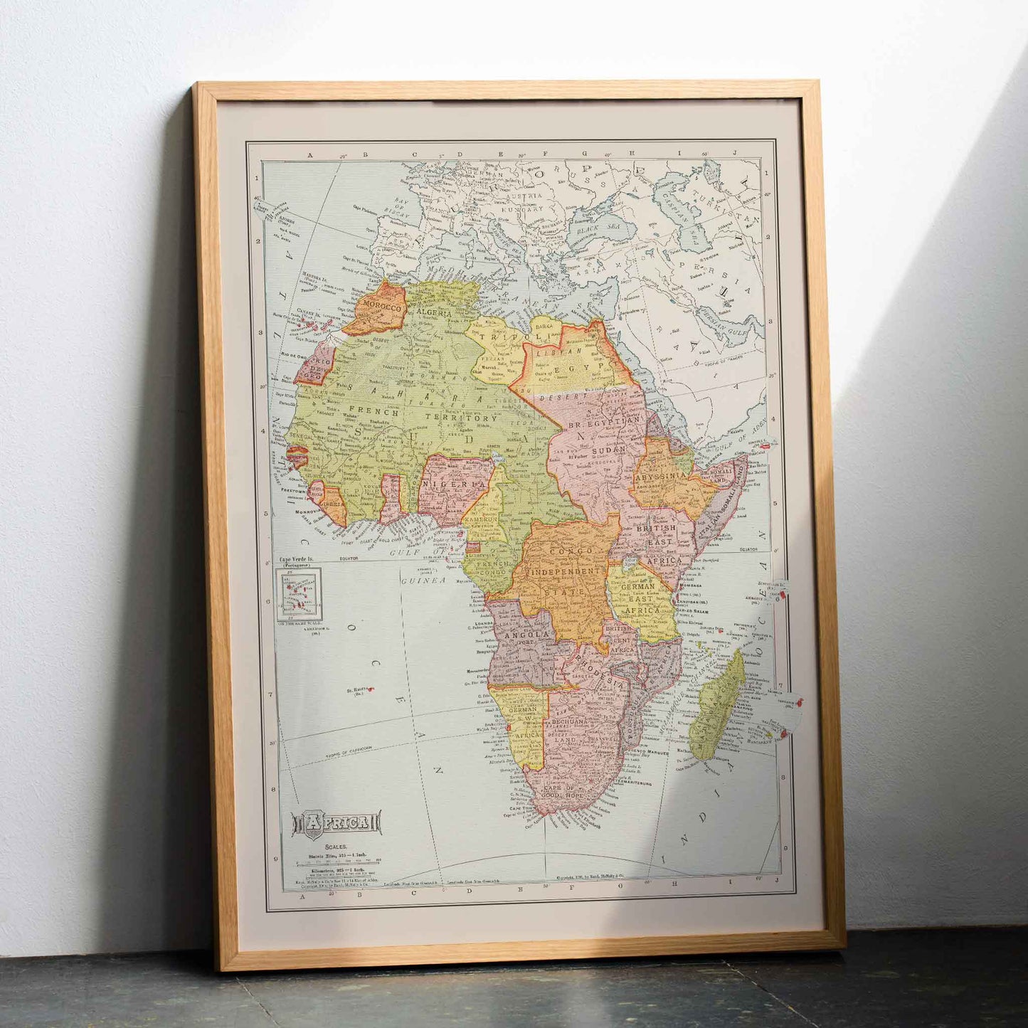
Rand McNally & Company gives this Africa map a clear connection to American reference publishing. Established in Chicago in 1856, the firm first became known for railway guides before expanding into educational maps. That background matters here: the 1907 publication was made to deliver geographic information to readers seeking knowledge of places beyond daily experience. The company name links this piece to practical reference publishing rather than personal studio authorship. For collectors of vintage poster history, it records how a major American mapmaker turned geographic knowledge into accessible wall art. Africa remains its central subject, framed by the publishing culture of early twentieth century America.
The Artwork
An Africa map from 1907 carries more than geographic information. It belongs to a period when printed atlases served readers seeking knowledge of distant territories. The continent is represented through the political vocabulary of its time, preserving colonial assumptions found in many Western reference works. The vintage print therefore works as a historical document, not a neutral picture of Africa. It opens questions about authority in printed geography. As wall art, it connects interior decoration with the history of information, asking viewers to consider how this map framed Africa for its original audience.
Style & Characteristics
The eye follows the broad outline of Africa, then travels across the finely printed place names. Thin red lines separate territories, while softly tinted regions distinguish neighboring areas without overpowering the lettering. Green carries much of the land, with yellow and pink marking adjacent areas; pale blue surrounds the coast and leaves Madagascar clearly detached to the southeast. A narrow border encloses the map, and a small publisher panel sits near the lower left. The vertical poster rewards close viewing because each printed label competes with the larger continental silhouette. As a vintage art print, its restrained ink palette keeps the map legible.
In Interior Design
In a quiet study, hang this vertical poster above a wood writing desk, where its tall proportions echo the height of a bookcase. A pale wall keeps the fine labels readable, while a dark frame can repeat the narrow outline around the map. The result is wall art with a useful pause built into it: a viewer can move from the room to the continent without leaving the desk. As home decor, the vintage print brings historical reference into daily surroundings. Its muted paper tones support a calm interior decoration scheme while the colored regions provide one focused point of visual interest.