




-

"Very nice Posters. The quality is amazing and we received it very quickly !"
-

"A shop to visit absolutely. Huge selection of posters. We spent more than an hour there !"
-

"Perfect to find gift. Price are very good. An they can frame and pack it on site"
About the Artist
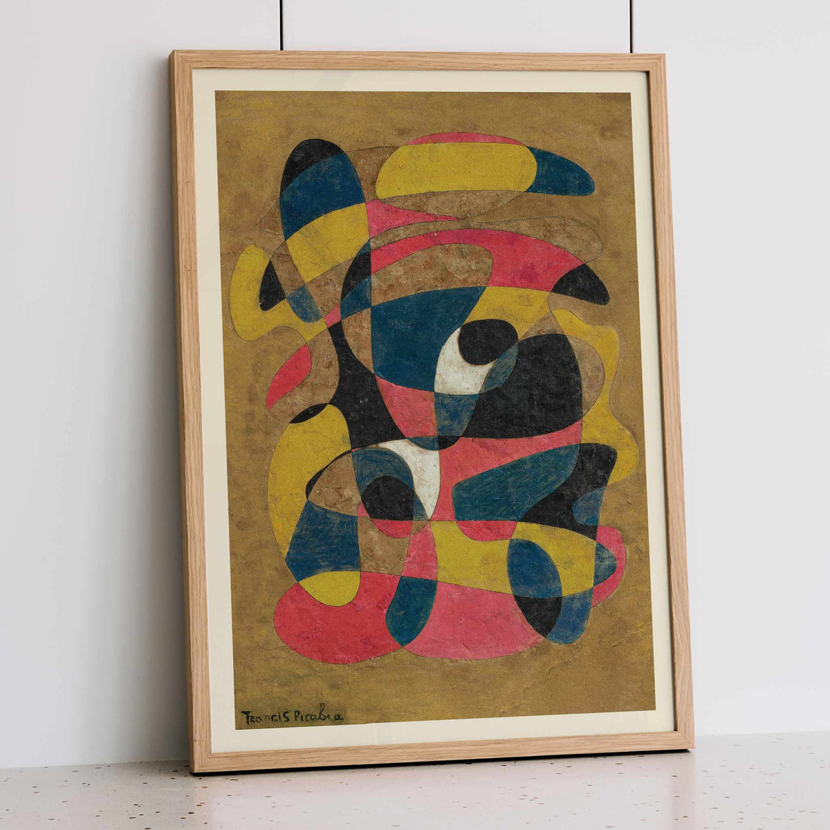
Composition marks one turn in the changing career of Francis Picabia. He launched the magazine 391 in Barcelona in 1917, making its pages a testing ground for the provocations that connected him to Dada. His earlier machine portraits had already challenged the idea that a portrait needed a human face. By the late 1930s, he had moved repeatedly between abstraction and figurative painting, refusing a single artistic identity. A Francis Picabia art print such as Composition brings that restless history into view: modernism becomes less a fixed style than an opportunity to change direction.
The Artwork
What happens when a painting offers no subject to recognise? Composition, dated 1939, asks viewers to approach it without the reassurance of a named person or place. Its title leaves interpretation open rather than supplying a narrative. Picabia had already spent decades testing what a picture could be, and this work continues that resistance to expectations. The date places it on the threshold of another European war, although that alone does not establish a political message. Reproducing the painting as a vintage poster makes this encounter available beyond the gallery, without prescribing what its abstraction should mean.
Style & Characteristics
A yellow arc near the top meets a blue tip, while a red band curls beneath it. Across the ochre ground, thin looping outlines pass through broader patches of colour. Black shapes swell between the curves, sometimes tapering to narrow points. Near the centre, a small dark oval rests against an off-white patch. Lower down, another pale passage separates blue from red. The mottled surface gives this vintage print an uneven, rubbed appearance rather than a glossy finish. In this abstract fine art print, the eye follows one curve only to find another crossing its path.
In Interior Design
Picture a reading room in late afternoon, where light grazes a walnut cabinet and this vertical poster hangs above it in a narrow black frame. A tobacco leather armchair echoes the ochre ground, while the red passages interrupt the subdued home decor. Leave enough bare wall around the fine art print to follow its looping shapes from the chair. Here, wall art becomes something to examine between chapters rather than a backdrop to the furniture. Keep the surrounding interior decoration restrained so the small pale openings and crossing lines remain visible across the room.