


You may also like
-
Geological map of the world Poster
James Reynolds · 1850 · Detailed world geology vintage print with color-coded strata and neat Victorian labels
Poster from €9 · Framed from €16
Regular price From €6,00Regular price -
Iceland Political Map Poster
Samuel Eggertsson · 1890 · Detailed Iceland political map vintage print with hand-tinted regions and crisp coastal labels
Poster from €9 · Framed from €16
Regular price From €6,00Regular price -
Gazetteer of the British Isles Poster
John Bartholomew · 1887 · Detailed British Isles vintage print balancing crisp labels with an atlas-like cartographic layout
Poster from €9 · Framed from €16
Regular price From €6,00Regular price -
Mountains Poster
James Reynolds · 1851 · Educational mountain-height vintage print combining labeled silhouettes into a dramatic panorama
Poster from €9 · Framed from €16
Regular price From €6,00Regular price


-

"Very nice Posters. The quality is amazing and we received it very quickly !"
-

"A shop to visit absolutely. Huge selection of posters. We spent more than an hour there !"
-

"Perfect to find gift. Price are very good. An they can frame and pack it on site"


About the Artist
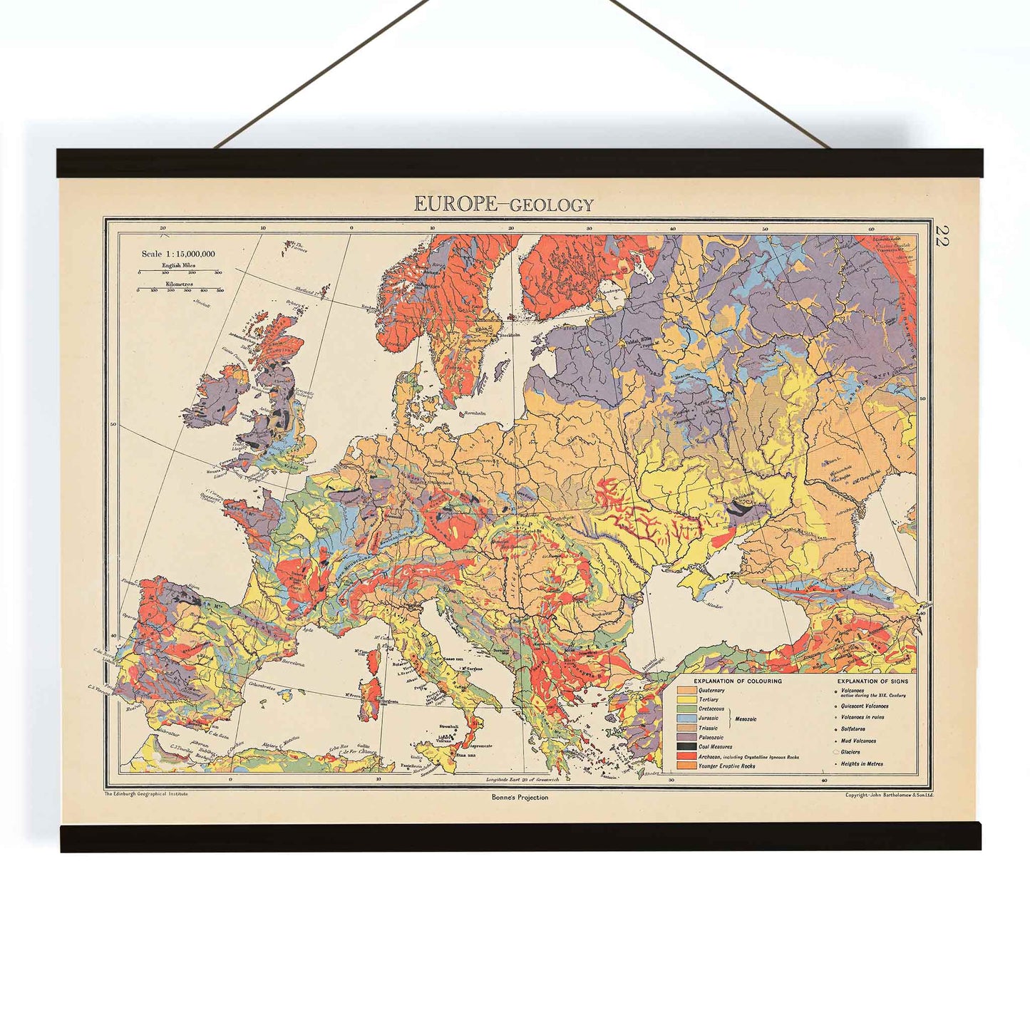
John George Bartholomew was one of Britain’s most respected cartographers, known for bringing scientific mapping into a clear and elegant visual language. His work helped shape modern atlas design, where geography and geology could be presented with both precision and readability. Today his maps are valued not only for their information, but also as collectible map prints that sit naturally between science and design.
Created in 1942, this Europe geology map reflects an era when printed reference works carried specialist knowledge into schools, libraries, and private studies. It speaks to a time when cartography was expected to serve education, while also offering a refined object for the wall.
The Artwork
Rather than focusing on political borders, the map presents Europe through the lens of its geological structure. It gathers the continent into a single explanatory image, helping viewers understand how the land is organized beneath its visible surface. The result is a work of public instruction as much as visual communication, designed to make complex scientific knowledge more accessible.
As a historical scientific map, it belongs to the long tradition of atlases used for teaching and reference. Its purpose is practical, but it also carries the quiet authority of mid-century scholarly publishing, where clarity and trustworthiness were central to the image.
Style & Characteristics
The composition is broad and horizontal, with Europe filling the sheet inside a neat border, title, and legend. Distinct regions are marked in yellow, blue, red, beige, and grey, creating a layered pattern that separates geological zones with clarity. Fine linework traces coastlines, internal divisions, and structural detail across the continent.
The visual effect is orderly, dense, and highly legible, with enough color variation to give the map a decorative rhythm. The palette and drafting style give it the character of a scientific print, while its format also aligns naturally with horizontal posters and other large-format reference pieces.
In Interior Design
This map suits interiors that welcome structure, muted color, and intellectual character. It works well in a study, office, library, hallway, or living room, especially where wood, leather, brass, or painted walls provide a calm backdrop. Its horizontal format makes it easy to place above a desk, sideboard, or sofa.
As wall decor, it brings a measured sense of history without feeling heavy. It can stand alone as a focal point or join a gallery wall shaped around travel, knowledge, or classic framing. For rooms that combine utility with style, it offers a polished presence and a thoughtful sense of place.